Unity Smart Living Student Housing Brand Identity Design
Brand Identity Design & Comprehensive Branding System for UNITY Smart Living


Real Estate Branding & Brand Identity Design for UNITY Smart Living Student Housing
UNITY Smart Living was created as a contemporary student housing brand designed to offer much more than accommodation. The brand was built around a complete living experience that combines comfort, safety, community, functionality and a modern sense of independence for students and young residents.
The project focused on the development of a comprehensive brand identity design system for a new generation of student residences. Rather than approaching the work as a simple logo design project, the identity was designed to support a full real estate branding and property branding ecosystem across residential buildings, shared spaces, printed materials, digital platforms, marketing communication and everyday resident touchpoints.
UNITY Smart Living operates in a category where trust, clarity and emotional connection are essential. Students and their families are not simply choosing an apartment. They are choosing a living environment that needs to feel safe, organized, modern, accessible and supportive. The branding system therefore had to communicate both practical reliability and a warmer sense of belonging.
The result is a flexible student accommodation branding system that brings together strategic thinking, real estate brand identity, visual identity design, environmental graphic design, app branding, wayfinding design and communication design into one coherent brand experience.
Project Overview
UNITY Smart Living was developed as a premium student living concept for furnished and fully equipped residences designed around the needs of modern student life. The brand needed to express the idea of smart living in a way that felt contemporary, trustworthy and approachable, while remaining strong enough to scale across multiple buildings, cities and communication channels.
The project extended across both physical and digital environments. The visual identity needed to work on building signage, interior branding, wayfinding systems, printed communication, digital interfaces, marketing collateral and online booking-related touchpoints. This required a brand design system with enough flexibility to adapt to different formats, while maintaining a clear and recognizable brand presence.
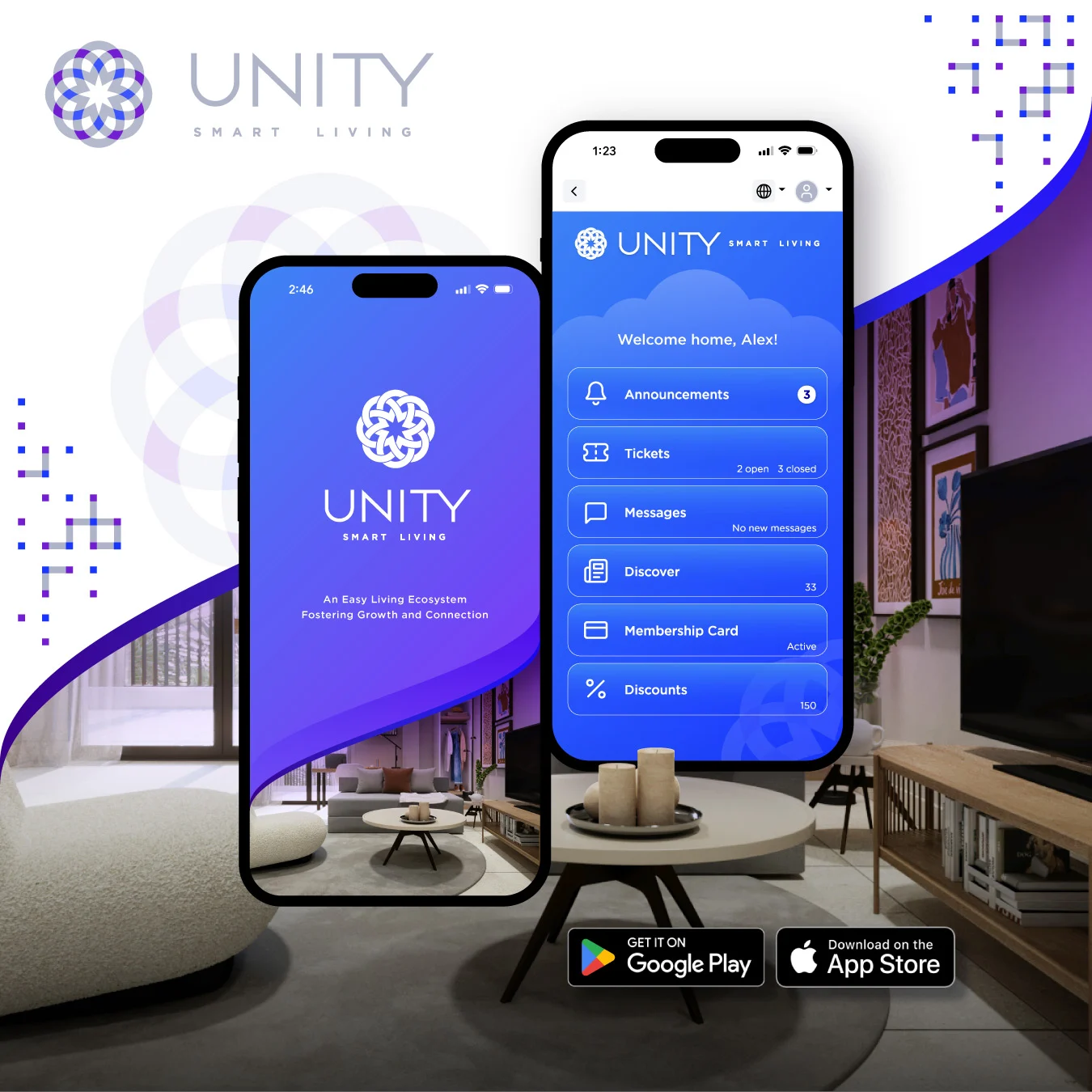
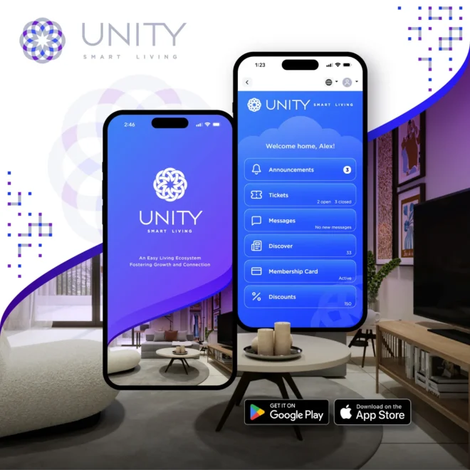
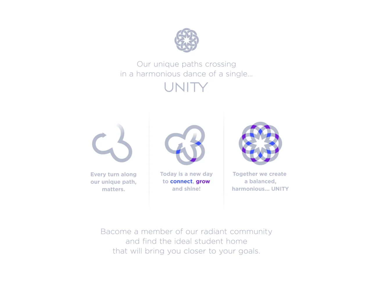
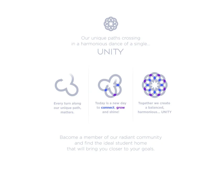
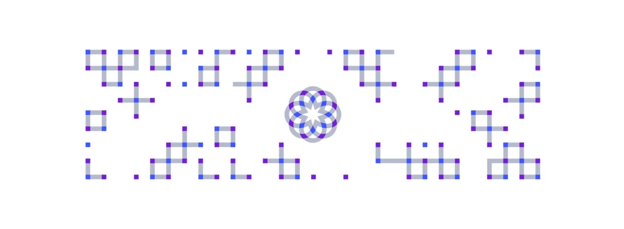
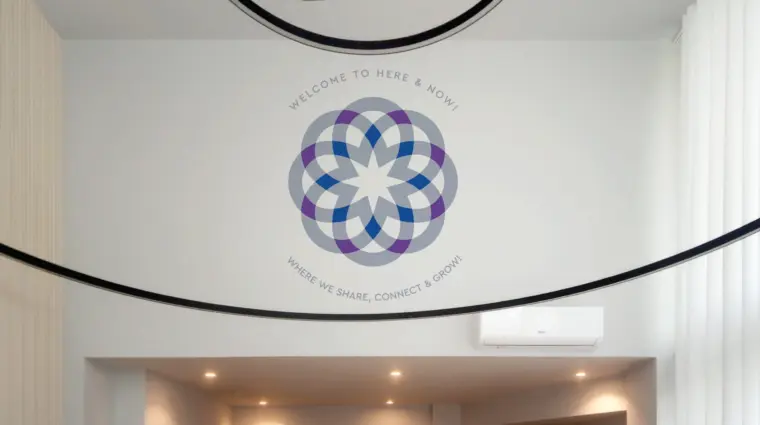
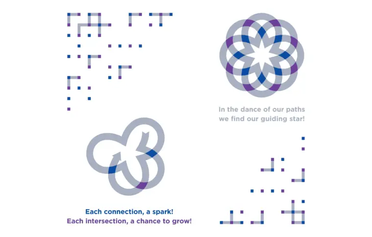
At the heart of the identity lies a symbolic emblem composed of interwoven geometric forms connected into a unified structure. The mark reflects the idea of community, collaboration and personal growth within a shared living environment. It visually expresses how different people can live, interact, study, relax and evolve together within one connected ecosystem.
This symbolic structure became the foundation for the wider brand identity design. Repeating geometric patterns, graphic systems and spatial applications were developed from the core mark, creating a consistent visual language that could move naturally from a mobile interface to the environmental graphics of an entire residential building.
The Branding Challenge
Creating Trust in a Competitive Student Housing Market
Student housing is a practical decision, but it is also an emotional one. Students need comfort, independence and convenience. Parents often look for safety, reliability and transparency. A student accommodation brand therefore needs to communicate more than availability or location. It needs to create confidence.
The challenge for UNITY Smart Living was to develop a brand identity that could position the company as a modern, organized and dependable student housing provider. The visual language had to support the promise of comfortable residences, high-quality services, central locations and a living experience designed around student needs.
At the same time, the identity needed to avoid feeling cold or purely corporate. Student living is about belonging, growth and everyday experience. The brand had to feel structured, but also human. Functional, but also warm. Professional, but not distant.
Connecting Real Estate Branding with Everyday Experience
Real estate branding often focuses on buildings, locations and visual prestige. UNITY Smart Living required a more complete approach. The brand had to work not only as a property identity, but also as a service experience.
The system needed to support how residents discover apartments, compare options, understand services, move through buildings, recognize shared spaces and interact with the brand online. This meant that the branding could not be limited to a logo or color palette. It had to become a complete brand communication system.
The design challenge was to create a visual identity that could operate across:
• Student residence branding
• Property branding and real estate communication
• Building signage and wayfinding design
• Interior branding and shared-space graphics
• Environmental graphic design
• Digital product branding
• App branding and online booking interfaces
• Printed marketing collateral
• Social media and promotional communication
• Everyday resident information touchpoints
Strategic Brand Direction
A Brand Built Around Community and Connection
The name UNITY suggests togetherness, shared values and connection. These ideas became the strategic foundation for the visual identity. The brand needed to communicate a sense of belonging without relying on obvious or generic student imagery.
The emblem was designed as a network of interwoven geometric forms. Each form can be understood as an individual element, but together they create a unified structure. This makes the symbol especially relevant to student housing, where different people live independently while participating in a shared community.
The mark also references networks, digital systems and organized movement. These associations help connect the physical residence experience with the digital and service-oriented aspects of the brand. UNITY Smart Living is not just a place to stay. It is a structured living system designed to make student life simpler, safer and more connected.
From Logo Design to Complete Brand Identity System
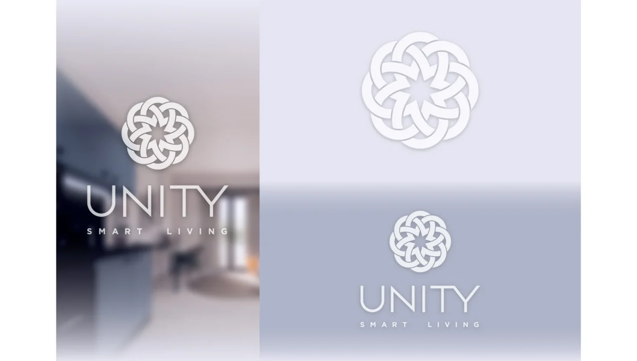
The project moved beyond traditional logo design into the creation of a complete brand identity system. The emblem, typography, color palette, graphic patterns and layout principles were all designed to work together across different environments and scales.
The system had to remain clear and recognizable whether applied to a small app icon, a printed brochure, a building sign, a resident document or a large wall graphic. This required a disciplined visual structure and a flexible design language that could adapt without losing consistency.
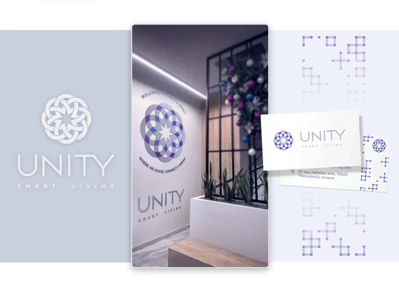
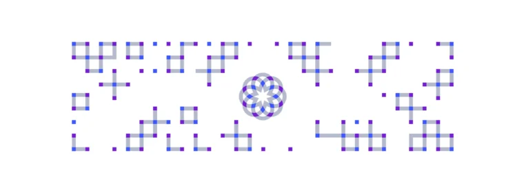
The geometric elements derived from the logo became a key visual asset. They were expanded into patterns, graphic compositions and environmental applications, allowing the identity to create rhythm and recognition throughout the brand experience.
Visual Identity Design
Symbol, Typography and Graphic System
The UNITY Smart Living logo combines symbolic meaning with practical functionality. Its interwoven structure expresses connection, community and growth, while its geometric construction gives the brand a contemporary and organized character.
The typography system was selected to support clarity, accessibility and modernity. In a student housing brand, information must be easy to read and understand. Residents, parents and prospective tenants need to quickly process practical details, from apartment features and locations to booking information and building guidance.
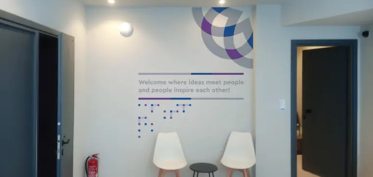
The graphic design system extends the logo into a broader visual language. Repeating structures create a sense of movement and consistency, while giving the brand a recognizable visual texture. These patterns can be used across printed materials, digital interfaces, interior graphics and environmental design, helping UNITY Smart Living maintain a unified presence across every touchpoint.
Color Palette and Brand Atmosphere
The color palette was developed to communicate clarity, calmness and contemporary living. Student housing brands need to feel energetic enough to appeal to young residents, but also stable enough to inspire trust. The visual tone therefore balances freshness with reliability.
The identity avoids unnecessary visual noise. Instead, it uses structure, repetition, spacing and clear contrast to create a brand environment that feels organized and easy to navigate. This is especially important for a brand connected with living spaces, where the design should support comfort and orientation rather than overwhelm the user.

Property Branding and Environmental Graphic Design
Branding Across Physical Spaces
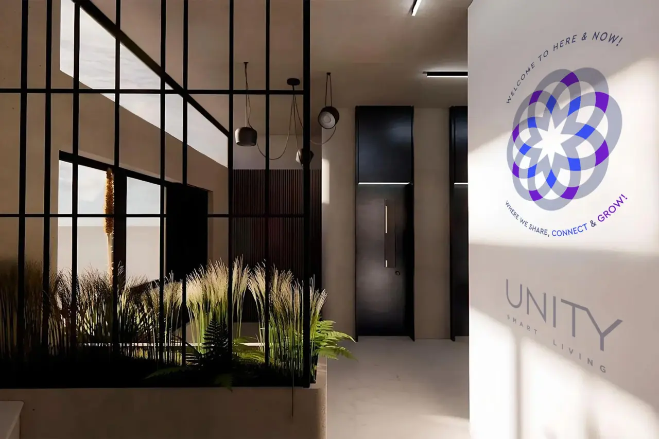
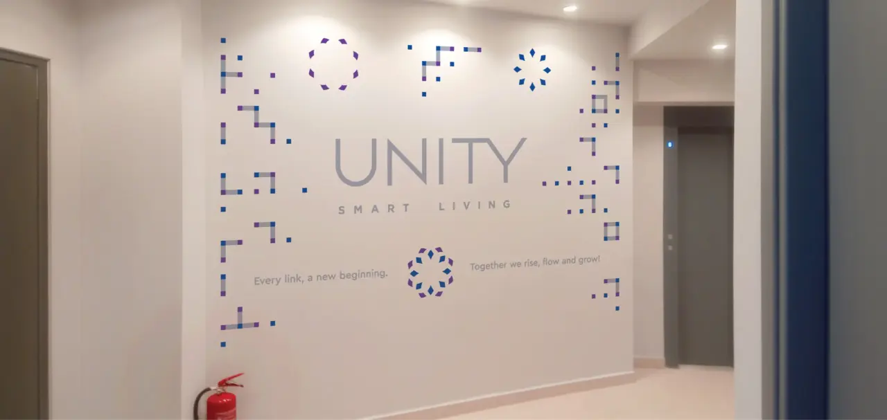
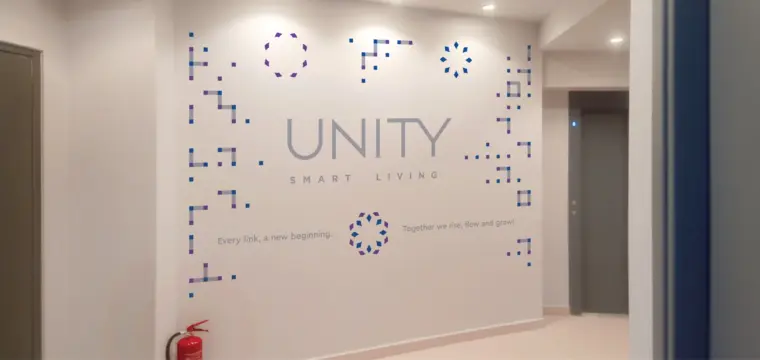
A strong student housing brand needs to work inside the physical environment. For UNITY Smart Living, the visual identity was designed to extend into building signage, shared spaces, interior branding and environmental graphics.
These applications help residents experience the brand beyond screens and printed material. The identity becomes part of the space itself, supporting recognition, orientation and atmosphere throughout the residential environment.
Environmental graphic design can help define shared spaces, guide movement, reinforce community values and create a more memorable living experience. In this context, branding becomes a functional layer of the building, not just decoration.
Wayfinding Design and Resident Navigation
Wayfinding design was an important part of the overall real estate branding system. Student residences need clear navigation, especially when they include multiple floors, shared facilities, common areas and service points.
The visual identity was designed to support signage and wayfinding applications with clarity and consistency. A good wayfinding design system helps residents and visitors feel oriented, reduces friction and contributes to a more professional perception of the property.
For a student housing provider, this kind of communication design directly affects the quality of the resident experience. It makes the environment easier to understand and helps the brand feel more organized and trustworthy.
Digital Brand Experience
App Branding and Online Touchpoints
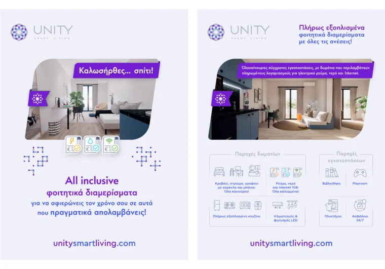
UNITY Smart Living also needed a brand identity capable of functioning across digital platforms. The company’s online experience includes apartment discovery, real-time availability, price comparison, floor plan exploration and booking-related actions. These digital touchpoints require a clear and consistent brand system.
The visual identity was therefore designed to support app branding, digital product branding and interface-related communication. The logo, colors, typography and graphic elements needed to remain effective on small screens, navigation elements, buttons, cards and promotional layouts.
A successful digital brand experience should feel connected to the physical brand environment. When a student moves from the website or app to an actual residence, the visual language should feel familiar. This consistency strengthens trust and reinforces brand recognition.
Supporting a Seamless Student Journey
From the first search for an apartment to the final booking process, the brand needs to support a smooth user journey. The UNITY Smart Living identity was developed to help make that journey feel clearer, more structured and more reassuring.
The same visual principles that guide the physical environment also support digital communication: clarity, hierarchy, consistency and ease of use. This makes the brand more recognizable while helping users understand information faster.

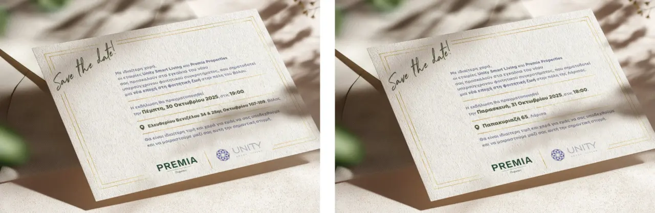

Marketing Collateral Design and Brand Communication
The project also included a broader graphic design system for marketing collateral and brand communication assets. These applications help the brand communicate its value across campaigns, printed pieces, digital promotions, social media and resident-facing materials.
For a student housing brand, marketing communication must speak to multiple audiences. It needs to appeal to students looking for independence and lifestyle, while also reassuring parents who care about safety, services, organization and value.
The design system helps UNITY Smart Living communicate benefits such as fully equipped apartments, included utilities, internet access, convenient locations, safety, study support and community-oriented living. By keeping these messages within a consistent visual framework, the brand becomes easier to recognize and remember.
Services Delivered
The project included a wide range of brand identity and communication design services:
• Logo design
• Corporate visual identity design
• Interior and exterior signage system design
• User interface (UI) design for the app
• Custom icon design
• Custom typography design
• Decorative applications designed to promote the brand culture
• Advertising and communication material
• Visual consistency system for social media communication
• Art direction
• Graphic design layouts for building covering applications
Through ongoing brand support and consistent visual communication, we help maintain the brand’s visual consistency and communication effectiveness through a structured Brand Archive: a complete corporate communication system designed to support UNITY Smart Living across physical, digital and communication environments.
Project Outcome
UNITY Smart Living demonstrates how strategic brand identity design can transform a student housing concept into a complete and recognizable living brand.
The final identity brings together logo design, property branding, real estate branding, environmental graphic design, wayfinding design, digital branding and marketing communication into a unified system. It helps the brand communicate comfort, safety, community and contemporary living while supporting long-term growth across multiple buildings, cities and resident touchpoints.
Rather than creating a visual identity for a single building or campaign, the project established a scalable brand system capable of expanding with the business. Every element was designed to support clarity, recognition and consistency, from the smallest digital interaction to the largest physical application.
For student housing, student accommodation, real estate and hospitality-related brands, this kind of integrated branding system can increase perceived value, strengthen customer trust and create a more coherent experience across every stage of the customer journey.
If this project sparked ideas about the future of your own business, we would be delighted to explore how strategic visual communication can elevate your customer experience, strengthen brand recognition and increase perceived value, starting with a comprehensive brand identity system.
If this project sparked ideas about the future of your own business, we would be delighted to explore how strategic visual communication can elevate your customer experience, strengthen brand recognition, and increase perceived value, starting with a comprehensive brand identity system.