Financial Education Brand Identity & Logo Design | Game of Money
Financial Education Branding for Game of Money
Game of Money is a prominent financial education platform in Greece, bringing together podcasts, online courses, seminars, festivals and an active community interested in financial literacy, entrepreneurship, investing and personal development.
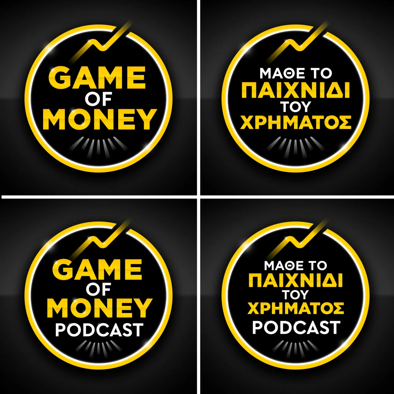
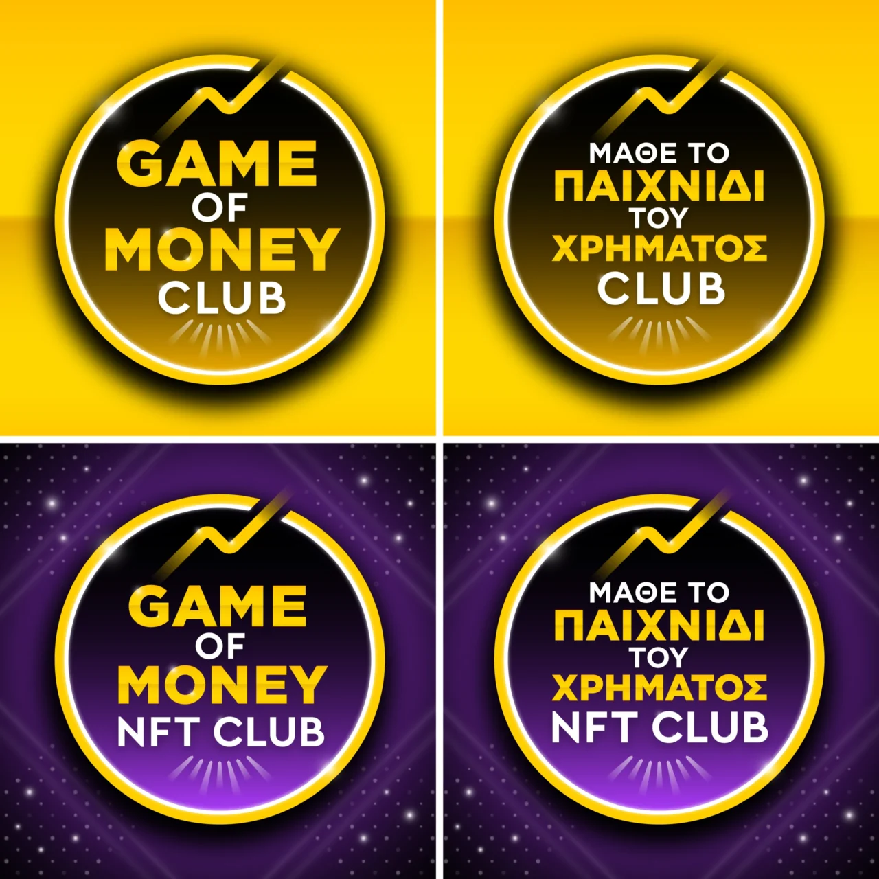
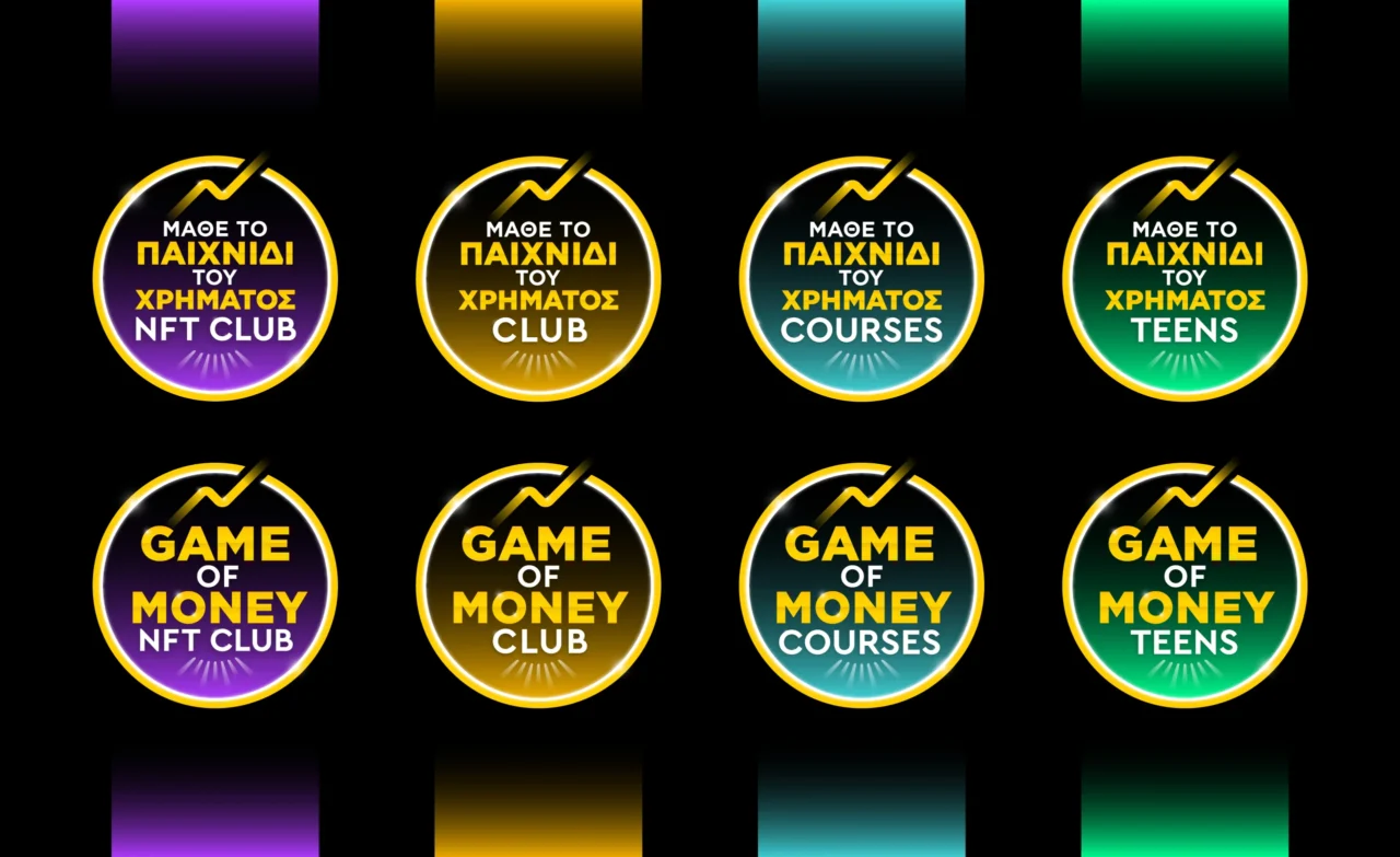
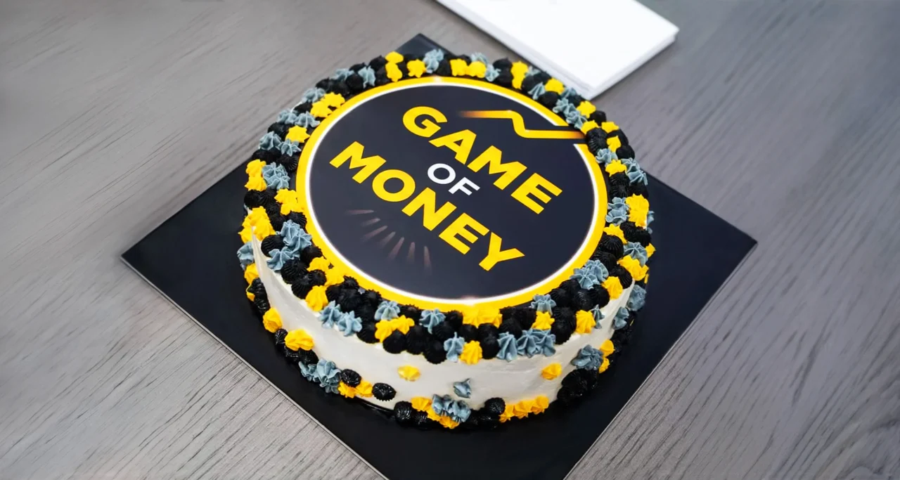
Plus Gravity developed the Game of Money brand identity and logo system to give this expanding educational ecosystem a clear, recognizable and scalable visual presence. The project included the primary Game of Money logo and a coordinated family of sub-brand identities for Game of Money Podcast, Game of Money Club, Game of Money NFT Club, Game of Money Courses and Game of Money Teens.
The identity was designed to support communication across digital platforms, educational content, social media, live events, merchandise, presentations and large-scale branded environments. A consistent brand architecture connects every initiative with the master brand while allowing each program to communicate with its own audience.
The resulting financial education branding system expresses progress, knowledge, community and the pursuit of financial freedom through contemporary typography, geometric clarity and a memorable symbolic gesture.

Project Overview
Game of Money operates across several formats and audience groups. Its content ranges from introductory financial education to entrepreneurship, investing, professional development and community events. The visual identity therefore needed enough flexibility to support new products and experiences while preserving immediate recognition.
The branding project established a unified visual language for the central platform and its growing portfolio of educational initiatives. Logo design, typography, symbolic form and sub-brand naming were organized into a coherent system that can evolve alongside the organization.
The Branding Challenge
Financial education combines complex information with deeply personal goals. The identity needed to communicate credibility and expertise while remaining approachable for people at different stages of their financial journey. It also needed to function across compact digital formats, podcast artwork, course materials, festival graphics and physical applications.
A second challenge came from the expanding number of Game of Money initiatives. Each sub-brand serves a distinct purpose, yet every touchpoint contributes to the reputation of the same organization. The brand architecture was structured to help audiences recognize this connection quickly and understand how each program belongs within the wider Game of Money ecosystem.
Brand Strategy and Architecture
The strategy centered on a master brand supported by a consistent family of sub-brands. Shared typographic principles, proportions and graphic relationships create recognition across the system. Individual descriptors such as Podcast, Club, Courses and Teens provide clarity for each offering and make future extensions easier to integrate.
This approach gives Game of Money a practical framework for growth. New educational products, community initiatives and event formats can adopt the established visual language, reducing fragmentation and strengthening cumulative brand recognition over time.
Logo Design Concept
A Symbol of Growth and Financial Progress
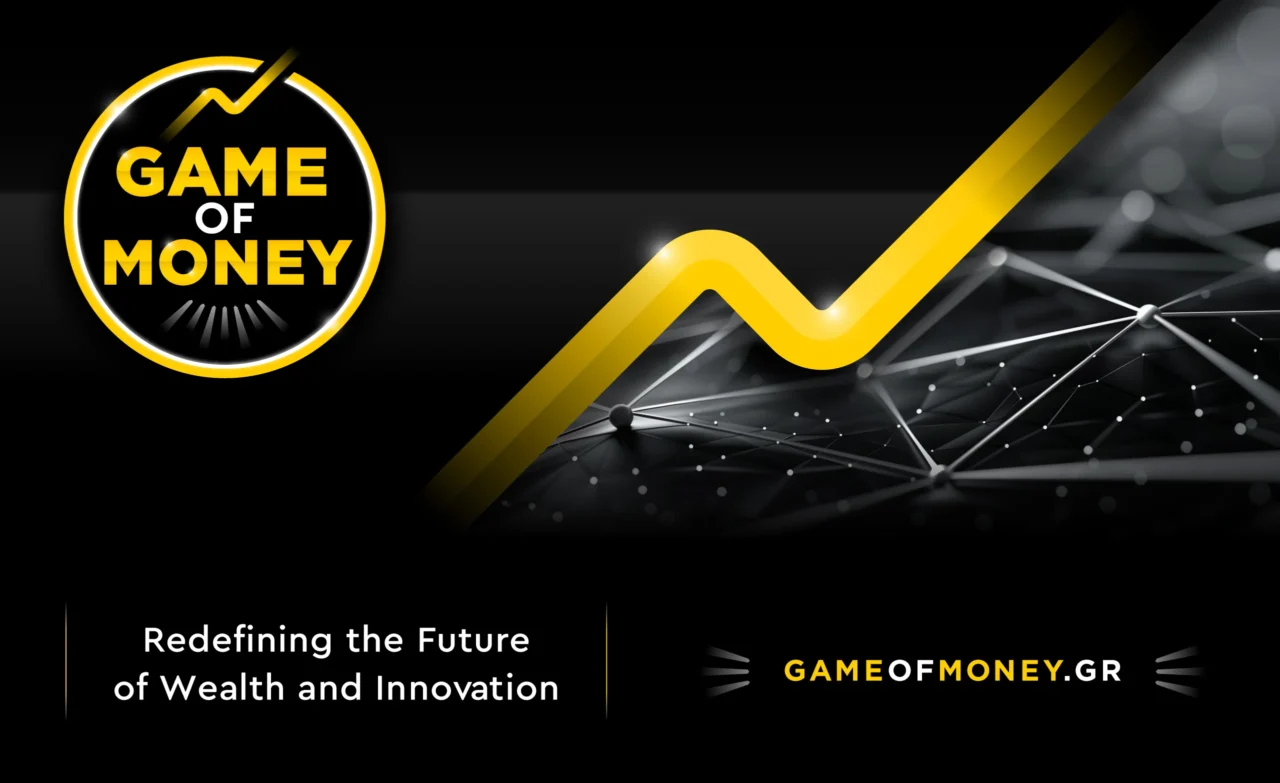
The Game of Money logo combines clean contemporary lettering with a distinctive line that extends beyond the boundary of a circular form. The gesture represents progress, continuous development and the ability of knowledge to open new possibilities.
The line also connects with the central promise of financial education: helping people expand their understanding, make informed decisions and move toward goals they define for themselves. Its simple geometry keeps the symbol recognizable at small sizes and gives it enough presence for event graphics, signage and branded merchandise.
Typography and Visual Character
The typographic system balances authority with accessibility. Clear letterforms support readability across educational and promotional content, while the logo construction gives the brand a confident and contemporary character. The visual tone reflects an organization that presents financial knowledge in an engaging, structured and practical way.
Scalable Sub-Brand Identity System
The sub-brand logo system extends the main identity across Game of Money Podcast, Game of Money Club, Game of Money NFT Club, Game of Money Courses and Game of Money Teens. Each identity retains the recognizable Game of Money structure and introduces a clear descriptor for its specific audience and format.
Consistency across these identities supports trust and makes cross-promotion more effective. A listener who discovers the podcast can recognize the same brand when encountering a course, festival or community program. This visual continuity helps the organization present a connected portfolio of educational experiences.
Digital, Educational and Event Applications
The visual identity was developed for a broad range of applications, including podcast covers, social media content, digital course materials, presentations, websites, festival communication, stage graphics, merchandise and community assets. Strong contrast and disciplined composition help the system remain clear across changing formats and screen sizes.
For live events, the identity provides a recognizable visual anchor that connects speakers, sessions and promotional material. Across digital education, it creates consistency between discovery, registration and participation. These applications strengthen the relationship between the visual brand and the experience delivered by Game of Money.
Business Value and Outcome
The completed brand identity gives Game of Money a structured platform for long-term communication and expansion. The master logo establishes recognition, while the sub-brand system organizes a growing range of programs without diluting the central identity.
The project demonstrates how strategic financial services branding and educational brand identity design can support trust, portfolio clarity and community growth. A scalable logo system also improves production efficiency, since future initiatives can build on established rules instead of creating an unrelated visual direction for every launch.
Game of Money now has a cohesive visual language capable of supporting educational content, media, events and new audience segments as the platform continues to evolve.
Services
- Brand Strategy
- Financial Education Brand Identity Design
- Logo Design
- Sub-Brand Architecture
- Visual Identity System
- Podcast Branding
- Event and Festival Branding
- Digital Communication Design
- Art Direction
Planning a Scalable Brand Identity?
Plus Gravity creates strategic brand identity and visual communication systems for organizations with multiple services, products and audiences. Explore our branding portfolio or contact us to discuss a brand identity design project for your organization.