
Food Brand Key Visual & Photographic Illustration | Dryfo
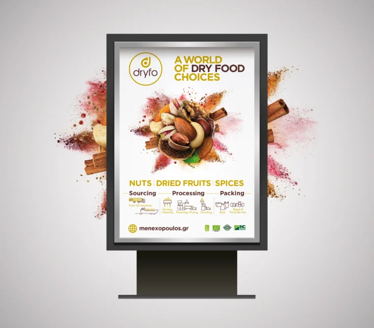
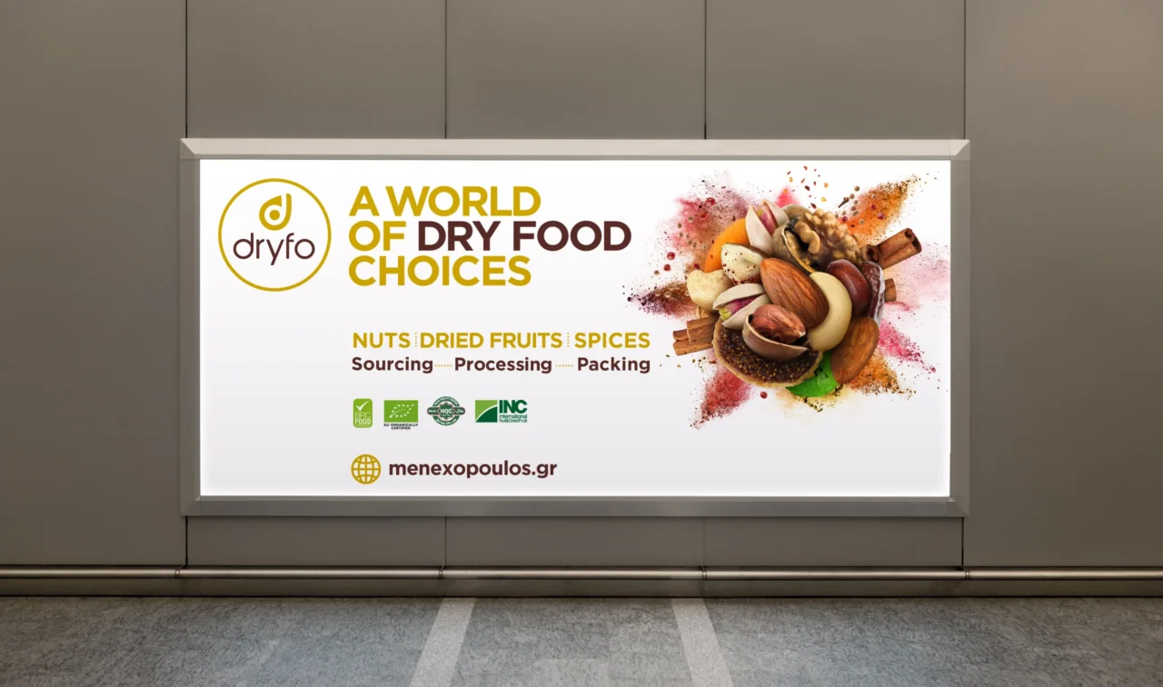
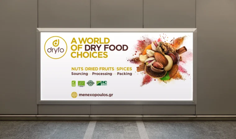
Food Brand Key Visual Design for Dryfo
Dryfo Menexopoulos Bros S.A. is a three-generation family business founded in 1950 and based in Thessaloniki, Greece. Its extensive product portfolio includes nuts, dried fruits, spices, flavourings, cereals, pulses, aromatic plants and confectionery ingredients, serving professional and consumer markets in Greece and abroad.
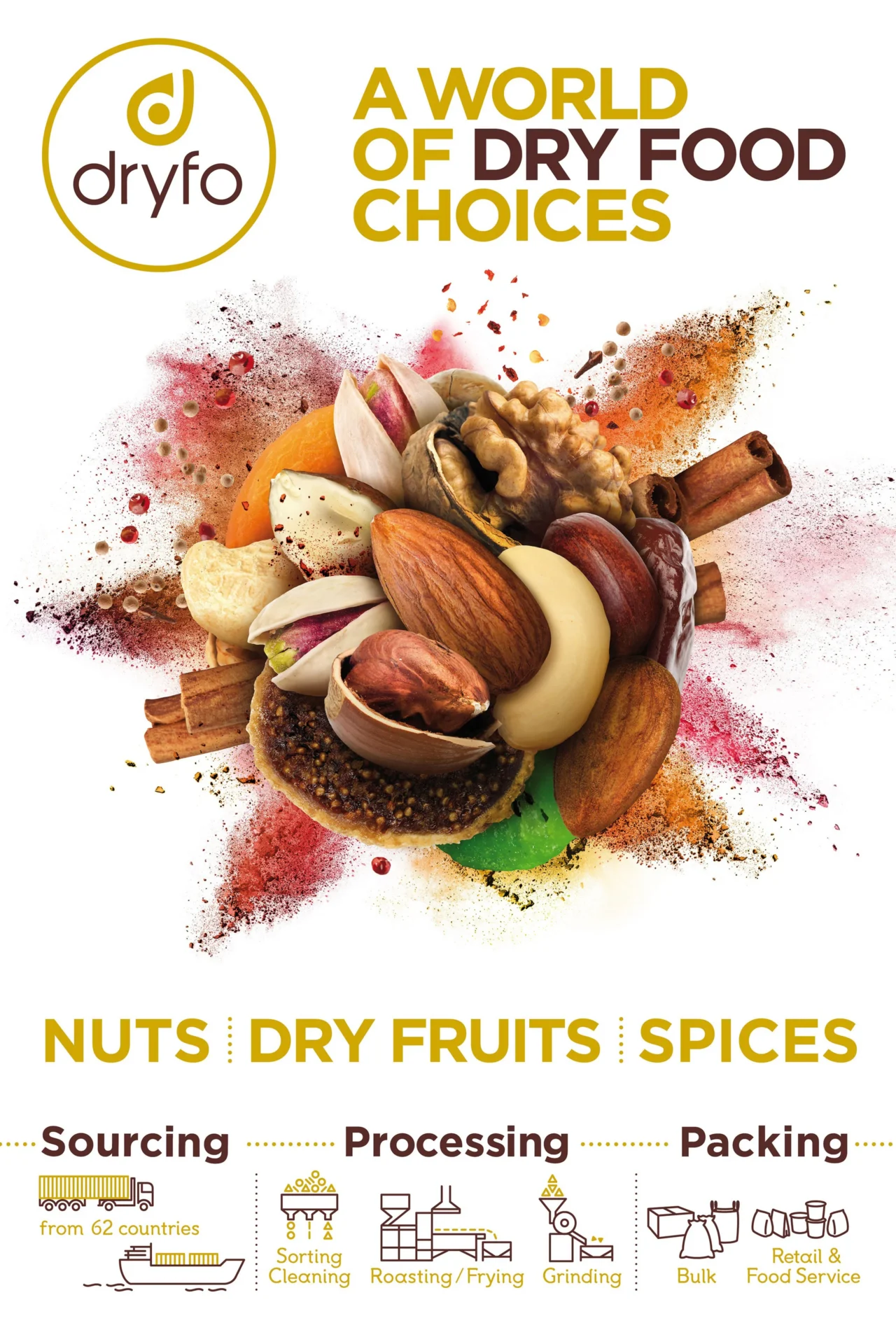
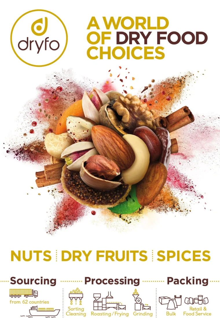
Plus Gravity created a distinctive food brand key visual built around photographic illustration and dynamic art direction. The concept transforms Dryfo’s product variety into an energetic visual composition that communicates abundance, quality and expertise at a glance.
Project Overview
Dryfo manages one of the broadest dry food portfolios in the Balkan region. This breadth represents a major commercial advantage and gives the brand a rich source of visual material. The communication system needed a central image capable of expressing the scale of the portfolio while preserving the natural colour, texture and appetite appeal of every ingredient.
The project focused on developing a flexible key visual that could become a recognizable element across corporate communication, advertising, exhibition graphics, printed materials and digital applications. A single strong visual idea would help connect diverse campaigns and create continuity across the brand’s communication.
The Creative Challenge
Food advertising design depends heavily on product authenticity. Nuts, dried fruit, grains, spices and confectionery ingredients each have distinct textures, colours and shapes. The composition needed to celebrate these qualities and keep every product visually appealing, even within a highly energetic scene.
Variety formed the strategic centre of the brief. Dryfo’s portfolio covers many categories, and the visual language needed to present this range as an organized expression of expertise. The final direction combines movement and precision, creating a memorable image with enough flexibility to support different layouts and messages.
Concept and Visual Strategy
An Explosion of Product Variety
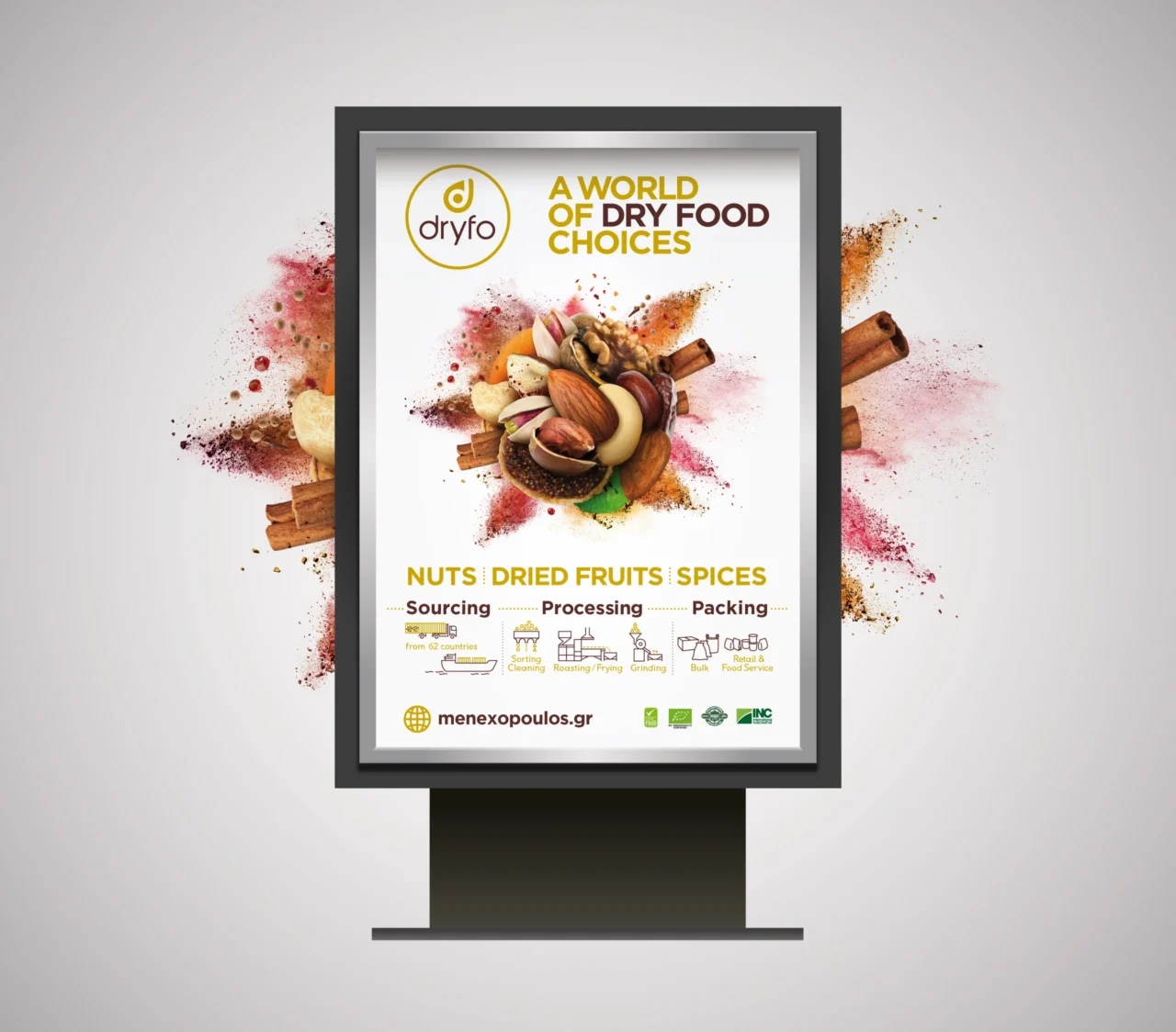
The central concept connects the diversity of Dryfo products with the irregular forms created by an explosion. Ingredients appear to burst outward in multiple directions, producing a rich field of fragments, particles, textures and colours. Each element contributes to a larger composition that feels energetic, abundant and carefully controlled.
This visual metaphor turns portfolio variety into an immediate brand message. The viewer experiences the scale and richness of the product range before reading supporting copy. The explosion also introduces a sense of freshness and momentum, qualities that strengthen the impact of advertising and exhibition communication.
Appetite Appeal and Product Recognition
Every ingredient remains recognizable through considered lighting, scale and positioning. Natural textures receive enough visual space to communicate freshness and quality. Colour relationships guide the eye through the composition and create contrast between nuts, fruits, grains and spices.
The result supports both emotional and practical communication. The imagery attracts attention through movement and visual intensity, while the individual products provide clear evidence of the portfolio’s breadth. This balance gives the key visual relevance across brand awareness campaigns, B2B presentations and product-focused communication.
Photographic Illustration and Art Direction
The final artwork combines product photography, photographic illustration, digital compositing and detailed retouching. Each component was selected and adjusted to support the overall direction of movement. Shadows, highlights and depth cues create spatial coherence, allowing separate ingredients to feel part of one unified event.
Art direction played a central role in maintaining consistency across the visual. The position and orientation of each product influence the rhythm of the composition. Larger forms create focal points, smaller fragments add energy, and areas of open space preserve clarity for headlines, brand messages or campaign information.
This method produces an ownable brand asset rather than a generic food photograph. The image can be adapted across different crops and formats while retaining the distinctive explosion concept and the recognizable Dryfo product world.
A Flexible Food Brand Communication System
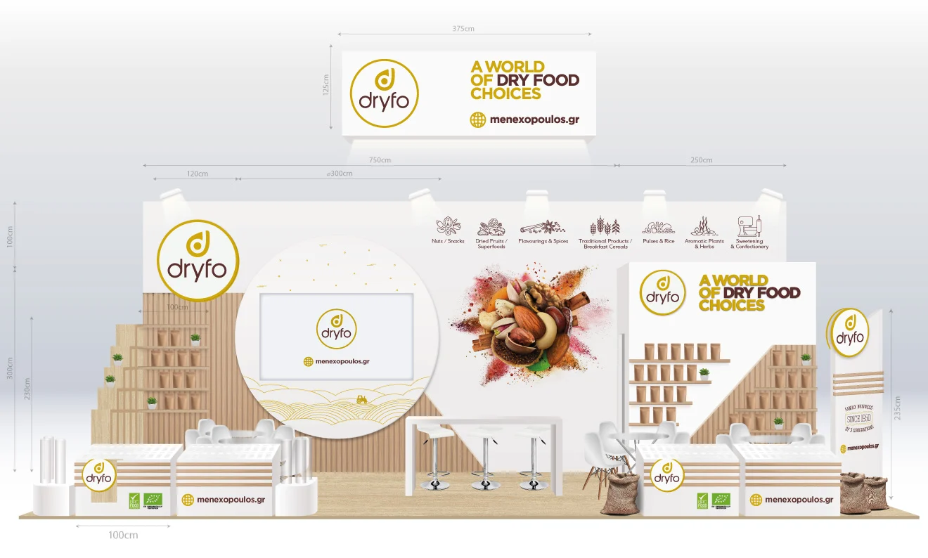
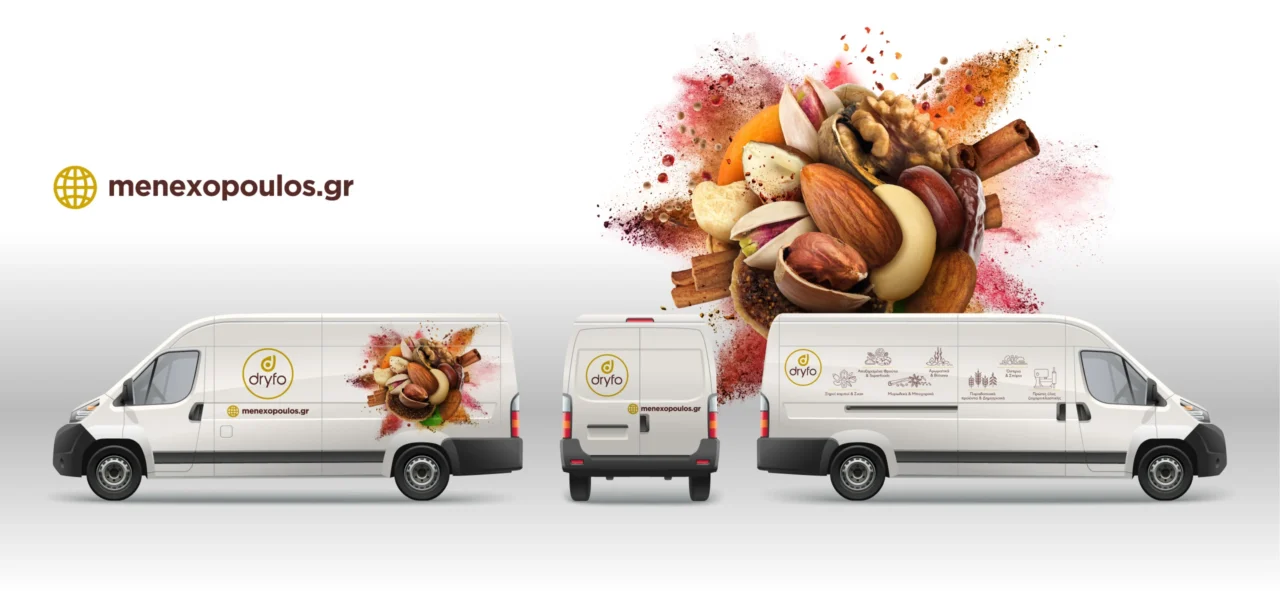
The key visual was designed for application across multiple communication environments. Wide compositions support exhibition walls, trade show graphics and corporate presentations. Vertical and compact crops can be adapted for printed publications, advertising layouts, social media and digital campaigns.
Its modular character also allows selected ingredients or sections of the composition to support category-specific messages. This flexibility extends the useful life of the creative concept and helps Dryfo maintain a consistent visual identity across campaigns with different commercial objectives.
For a company with a broad B2B food ingredient portfolio, visual consistency creates practical value. Sales teams, marketing partners and external suppliers can work with a shared creative direction, strengthening recognition while reducing fragmentation across communication materials.
Business Value and Outcome
The Dryfo key visual converts a central business strength, extensive product variety, into a distinctive visual asset. It gives the brand a memorable way to communicate expertise and abundance while keeping the quality of the ingredients at the centre of the image.
The project demonstrates how strategic key visual design can connect food photography, advertising creativity and brand identity. A strong central concept gives campaigns greater continuity, supports faster recognition and provides a scalable foundation for future communication.
Our long-standing collaboration with Dryfo has given us a detailed understanding of the company’s product range, commercial priorities and visual communication needs. This case study presents the development of the key visual and its applications during an earlier phase of the brand.
The visual identity and logo shown in these applications had already been established before our involvement, while the company’s current rebranding was completed at a later stage by a different creative partner. The knowledge developed through our long-term collaboration enables us to support future requirements in creative direction, campaigns and visual communication with continuity and an informed perspective.
Services
- Key Visual Design
- Food Advertising Design
- Photographic Illustration
- Food Product Photography Direction
- Digital Compositing and Retouching
- Creative Concept Development
- FMCG Visual Communication
- Art Direction
Looking for a Distinctive Food Brand Key Visual?
Plus Gravity develops strategic visual communication systems, photographic illustrations and campaign concepts for food, beverage and FMCG brands. Explore our branding and packaging portfolio or contact us to discuss a key visual and brand communication project for your organization.