
Kaizen Premium Baking Packaging & Brand Identity Design
Kaizen | Premium Artisanal Baking Β2Β packaging system
KAIZEN was developed as a contemporary premium B2B brand for the professional baking and pastry market.
Built around a comprehensive branding, packaging design, and visual identity system, the project communicates the expertise, product quality, and culture of continuous improvement that characterize a modern bakery brand.
Created in close collaboration with the creative team of Loulis Food Ingredients.
Project Overview
Creating a successful B2B food brand requires more than attractive packaging. It demands a clear positioning strategy, a recognizable visual identity, and a packaging design system that remains consistent across an expanding product portfolio.
Kaizen is a premium brand of professional baking and pastry ingredients developed for the B2B market. Its name references the Japanese concept of continuous improvement, an idea that naturally aligns with craftsmanship, precision, consistency and the pursuit of excellence in professional baking.
Kaizen was developed for Loulis Food Ingredients as a premium professional baking brand inspired by the Japanese philosophy of continuous improvement. The project combined brand identity design, custom typography, premium packaging design, product catalogue design and art direction into a cohesive communication system designed for the professional baking industry.
The objective was to translate this philosophy into a distinctive visual language capable of elevating the perception of technical food ingredients while remaining practical across a broad product range.
Rather than designing individual packaging pieces, the project focused on creating a scalable brand system capable of supporting future product expansion while maintaining a consistent premium identity.
The Challenge
Professional baking ingredients are often marketed through highly technical packaging that prioritizes information over brand perception. While functional, these products frequently struggle to communicate quality, craftsmanship or differentiation at first glance.
The challenge was to develop a B2B packaging design for premium food ingredients that would:
• Position Kaizen as a premium professional baking brand.
• Reflect the values of precision, craftsmanship and continuous improvement.
• Simplify navigation across multiple product categories.
• Create a recognizable visual identity capable of scaling consistently.
• Balance technical product information with a refined premium appearance.
• Extend seamlessly across packaging, catalogues and supporting communication materials.
Strategic Approach
The strategic foundation centred on transforming Kaizen from a collection of professional ingredients into a complete premium brand experience.
The Japanese philosophy behind the name became the conceptual framework for the identity. Rather than relying on obvious cultural references, the visual language expresses refinement through restraint, balance and carefully crafted typography.
The entire system was designed around three strategic principles:
Premium Positioning
Every visual element contributes to positioning the products above conventional ingredient packaging, reinforcing expertise, craftsmanship and perceived product quality.
Portfolio Clarity
A structured category architecture enables professionals to quickly distinguish between bakery, pastry and specialised product families while maintaining a unified brand appearance.
Long Term Scalability
The identity was designed as a flexible system capable of supporting future product launches, communication materials and brand extensions without losing consistency.
Brand Identity Design
The visual identity combines contemporary elegance with timeless typography.
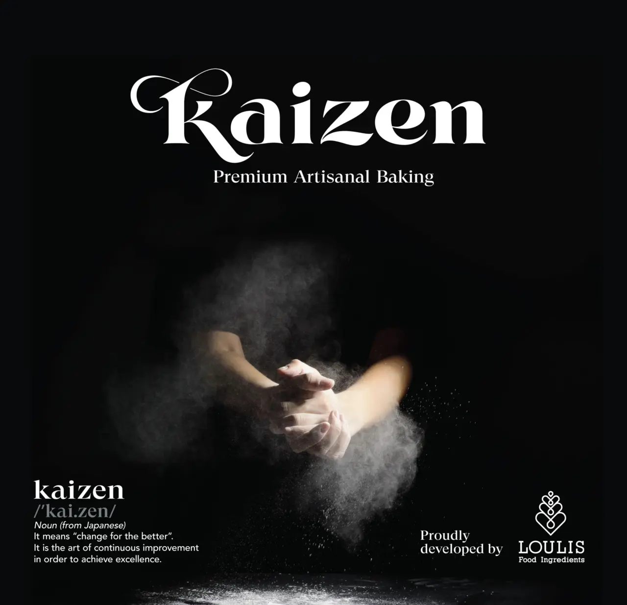
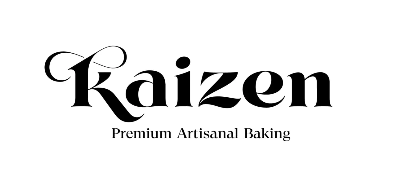
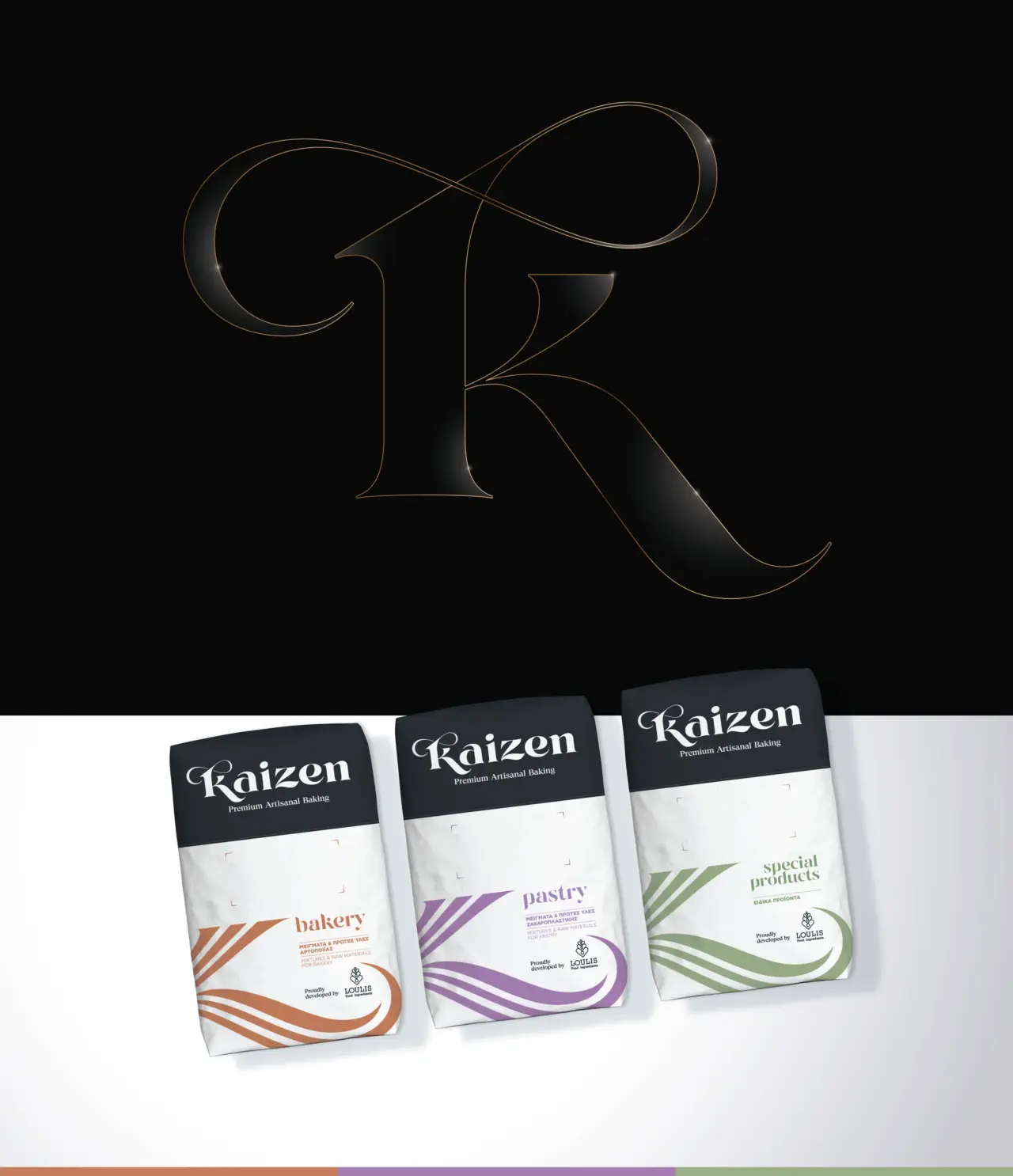
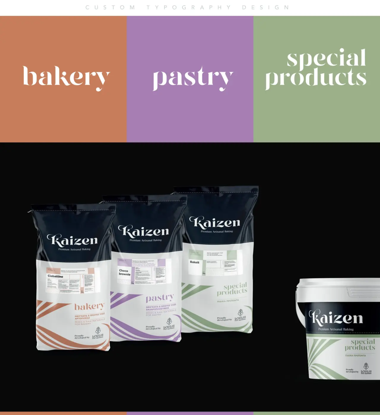
A bespoke custom typography logo design became the centrepiece of the identity, giving Kaizen a distinctive personality while communicating sophistication and craftsmanship. Every letterform was carefully refined to create an ownable visual signature that balances elegance with functionality.
Minimal colour usage, generous white space and disciplined visual hierarchy allow technical information to coexist comfortably with premium branding.
Rather than relying on visual complexity, the identity creates authority through proportion, typography and carefully controlled composition.
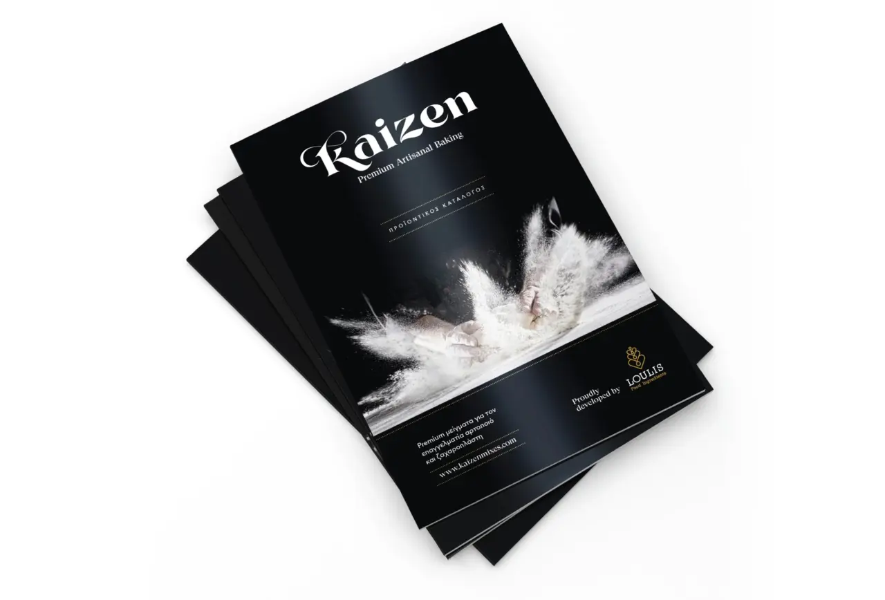
The art direction further reinforces the concept through dramatic flour photography that celebrates the craft of baking while visually expressing the philosophy of continuous improvement.
B2B Packaging Design for Premium Food Ingredients
Packaging was developed as a complete packaging design system rather than a collection of individual labels.
Professional ingredient portfolios often contain dozens of products across multiple categories and package formats. Consistency therefore becomes just as important as aesthetics.
The Kaizen packaging system organises the portfolio through a combination of category architecture, colour coding and flowing graphic elements that create immediate recognition while maintaining a refined premium appearance.
Each product family receives its own distinctive visual language while remaining clearly connected to the master brand.
This system provides:
• Clear differentiation between bakery, pastry and specialised product ranges.
• Strong shelf presence across multiple package formats.
• Flexible application to bags, buckets and future packaging.
• Consistent branding regardless of product complexity.
• Efficient expansion as new products are introduced.
The flowing graphic elements create visual movement throughout the portfolio while subtly referencing the continuous process of mixing, baking and refinement that defines both the products and the Kaizen philosophy.
Visual Identity System
A successful visual identity system extends far beyond the logo.
For Kaizen, every design element was created as part of a unified brand language capable of supporting both product communication and future brand growth.
The system includes:
• Custom typography
• Brand architecture
• Category colour coding
• Typography hierarchy
• Graphic patterns
• Photography direction
• Layout principles
• Product catalogue framework
By developing clear visual rules rather than isolated assets, the identity remains consistent across every customer touchpoint.
Applications
The project resulted in a complete branding ecosystem supporting both immediate communication needs and future expansion.
Deliverables included:
• Custom typography logo design
• Brand identity design for food products
• Visual identity system
• Premium packaging design
• B2B packaging design for professional baking ingredients
• Packaging design system
• Category architecture
• Product catalogue design
• Art direction
• Brand communication assets
Together these components establish a scalable foundation capable of supporting future product launches while maintaining consistency across the entire portfolio.
Outcome
Kaizen demonstrates how strategic branding can elevate even highly technical product categories.
Rather than treating packaging as a standalone graphic exercise, the project establishes a cohesive brand ecosystem where identity, packaging and communication reinforce one another.
The result is a premium B2B brand designed to strengthen perceived product quality, improve portfolio navigation and create a consistent visual presence across professional baking environments.
By combining brand strategy with a scalable packaging system, the identity provides a long term foundation capable of supporting future growth while preserving clarity and visual consistency.
This project is part of our wider work in packaging design and brand identity design for premium product brands.
Services
• Brand Strategy
• B2B Brand Identity Design
• Custom Typography Logo Design
• Visual Identity System
• Premium Packaging Design
• Food Packaging Design
• Bakery Packaging Design
• Packaging Design System
• Pastry Ingredients Branding
• Product Catalogue Design
• Art Direction
Looking for a Strategic Branding Partner?
Launching a premium food brand requires more than attractive packaging. It requires a clear strategy, a scalable identity and a packaging system capable of supporting long term growth.
Whether you are introducing a new ingredient range, repositioning an established portfolio or building a premium B2B brand from the ground up, we combine brand strategy, visual identity and packaging design into cohesive systems designed for real business needs.
If you are looking for a branding studio that approaches packaging as part of a broader business strategy, we’d be happy to discuss your next brand identity design project!
The Kaizen Brand Online
You can also explore the Kaizen brand at Kaizen Premium Artisanal Baking.