Typography
Custom lettering, typographic logo design, bespoke wordmarks and typography systems for stronger brand recognition and visual differentiation.
CUSTOM LETTERING AND TYPOGRAPHY PROJECTS
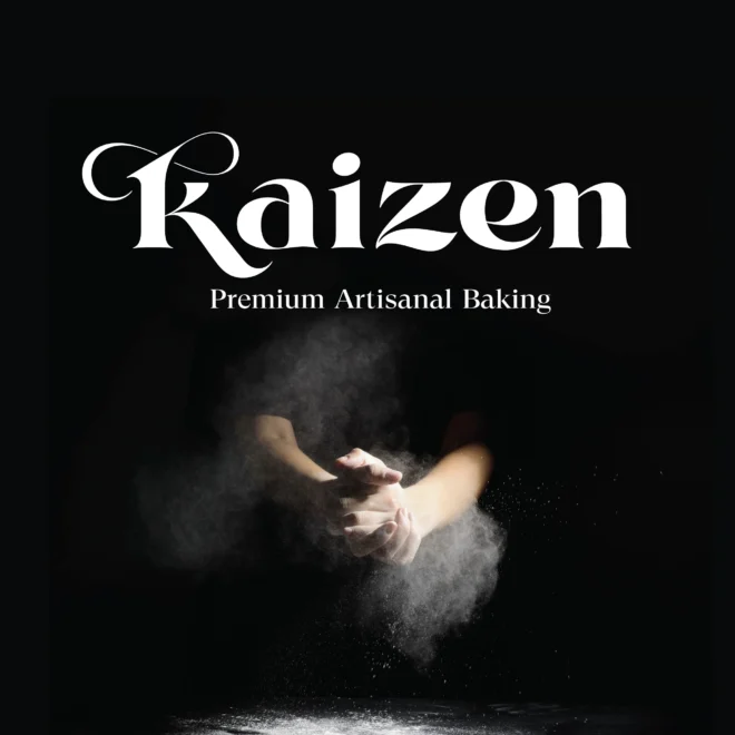
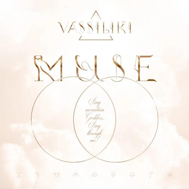
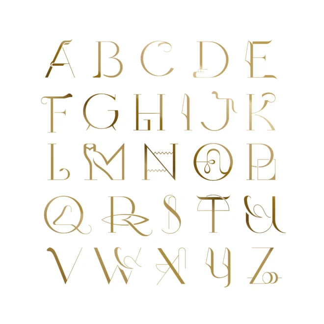
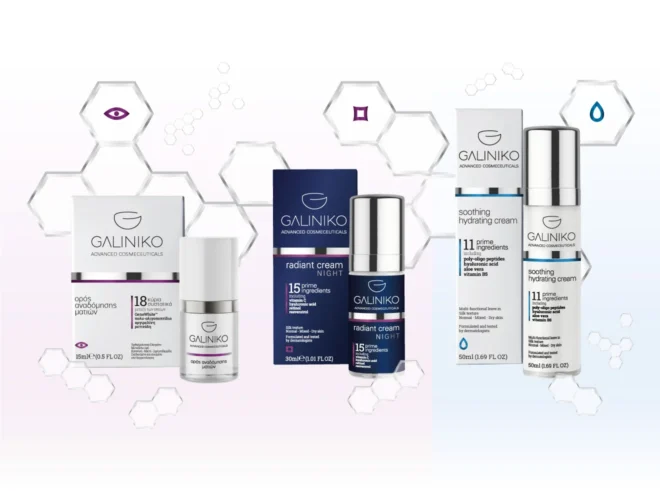
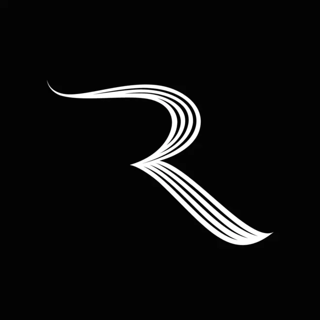
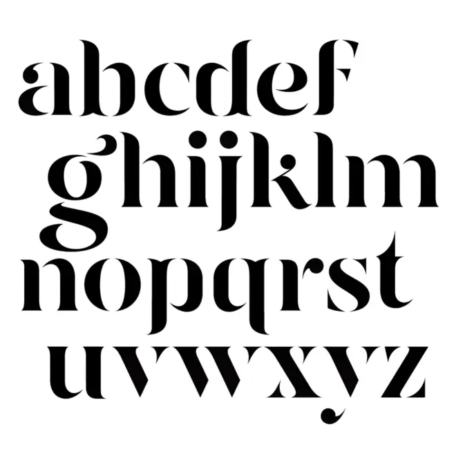
Custom Lettering, Typographic Logo Design & Bespoke Wordmarks
Typography can become one of the most recognizable elements of a brand identity. When the shape of every letter is designed specifically for the brand, the result moves beyond the use of an existing typeface and becomes a distinctive visual asset. Custom lettering, typographic logo design, bespoke wordmarks and typography systems give a brand the ability to communicate character, precision, authority and recognition through the form of language itself.
At Plus Gravity, custom typography is approached as one of the most important elements of differentiation and uniqueness in the formation of a brand’s image. The final result acquires qualities that can be meaningfully connected to the business or organization behind it. Letterforms are designed with close attention to every detail: the smoothness of curves, optical alignments, optical corrections, counters, spacing between forms, terminals and rhythm between letters. This level of control is one of the defining differences of Plus Gravity in logo design and brand identity design.
Typographic precision in the smallest details of form
Every letter carries visual information before it is consciously read. The weight of a stroke, the opening of a counter, the balance between straight and curved forms, the tension of a diagonal, the character of a terminal and the spacing between letters all influence how the meaning of a symbol or word is perceived. In custom lettering, these details can be designed with complete control, while an existing typeface is by nature designed for broad use. Brand identity design seeks differentiation and the expression of uniqueness.
In this way, a logo or wordmark can express confidence, elegance, clarity, warmth, technical precision, timelessness, innovation or premium value through the structure of the letters themselves. The result is controlled visual communication, designed so that the form of the word supports the meaning, positioning and personality of the brand.
A craft developed through continuous practice and theoretical study
The typographic approach of Plus Gravity is closely connected to the personal design path of Isaac Zakar. His fascination with letterforms, shape, proportion and visual rhythm began in childhood and has continued to evolve through decades of drawing, observation, practice and study. Over time, this skill has expanded into a systematic understanding of typography, visual perception and the way images help the mind recognize, compare and remember forms.
This approach combines hand-crafted design sensitivity with typographic theory and a broader interest in cognitive science. The aim is to understand how visual structure affects perception: how the brain reads shapes, how contrast and rhythm guide attention, how familiar and unfamiliar forms are processed, and how ancient mechanisms of recognition can influence clarity, memorability and emotional response.
Custom wordmarks as strategic elements of brand identity
A bespoke wordmark can give a brand a level of differentiation that is difficult to achieve with a standard typeface. When letters are designed specifically for the brand, every detail can be aligned with the desired identity. The logo can connect with the deeper ideas the brand wants to communicate, become more recognizable and form the basis for a wider, consistent visual communication system.
This custom approach is especially valuable for premium brands, food and beverage brands, hospitality concepts, product brands, personal brands and organizations that need a visual identity with a strong signature. Custom lettering can also support packaging design, signage, editorial design, digital applications, campaigns and complete visual communication systems.
What we can design through custom lettering and custom typography
- Custom lettering for logos and brand identities
- Typographic logo design and bespoke wordmarks
- Refinement of existing logos through corrections in the form of the letters
- Custom display typography for packaging, campaigns and editorial design
- Lettering systems for corporate communication and brand identity applications
- Typographic hierarchy, spacing, optical corrections and visual rhythm
- Applied art direction for identities based on typography
- Visual consistency guidelines for typographic use across brand touchpoints
Selected custom lettering and typography projects by Plus Gravity
The selected projects above show how custom typography can become a central element of brand recognition and differentiation. If your organization is developing a logo, wordmark, packaging system, campaign or brand identity where the shape of the letters can become a meaningful visual asset, you can contact Plus Gravity to explore how bespoke typography can strengthen the way your brand is perceived and remembered.

