Custom Lettering Design as a Brand Identity System
Strong visual identities are built through systems.
Typography is one of the most influential components of those systems, contributing to recognition, consistency, and character across every touchpoint.
The letterforms presented here were developed as an exploration of the visual principles embedded within the Plus Gravity identity. Each character was designed to operate as part of a coherent typographic language, extending the logic of the original logotype into a broader visual system.
The project illustrates how custom lettering can strengthen brand recognition and support a more distinctive and consistent visual presence over time.
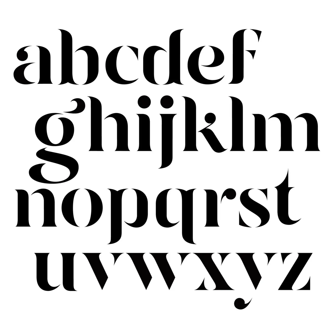

The typeface was developed directly from the structural logic of the Plus Gravity logotype.
Every character was drawn individually, using the same formal vocabulary that defines the original identity: high contrast forms, sculpted transitions, sharp terminals, and a balance between elegance and visual tension.
Particular attention was given to rhythm, proportion, counterforms, and optical balance to ensure that each letter felt like a natural extension of the system rather than an isolated drawing.
The result is a custom lettering collection that demonstrates how a strong visual identity can evolve into a broader design language while maintaining coherence across multiple applications.
This exploration also served as a study of brand consistency, illustrating how distinctive visual decisions can translate into interconnected assets that strengthen recognition over time.
Interested in building a strong brand with a distinctive typographic & visual identity?
We help organizations create custom visual communication systems that strengthen recognition, consistency, and long-term brand value.
Explore our custom lettering design services