


A rebranding system for a children’s activity venue
Dreamhouse is a children’s activity venue in Athens, created around play, imagination, learning experiences and shared moments for children and families. The brand needed a visual identity capable of expressing joy and creativity, while also supporting a growing range of services, events, workshops, communication materials and physical brand touchpoints.
Dreamhouse approached Plus Gravity with the objective of evolving its visual identity into a more distinctive, cohesive and recognizable brand. The aim was to create a complete brand identity design system that could support multiple activities under one clear visual language and help the venue communicate with parents, children and visitors in a more structured and memorable way.
The strategic idea behind the Dreamhouse identity
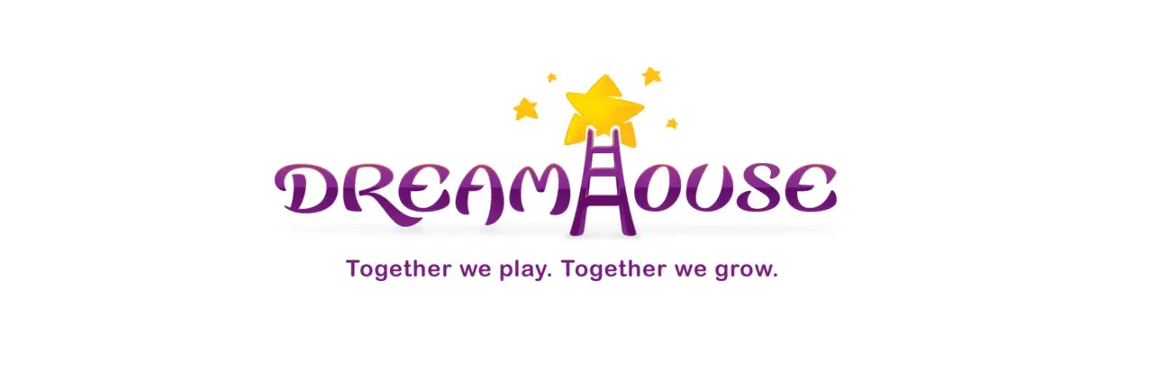
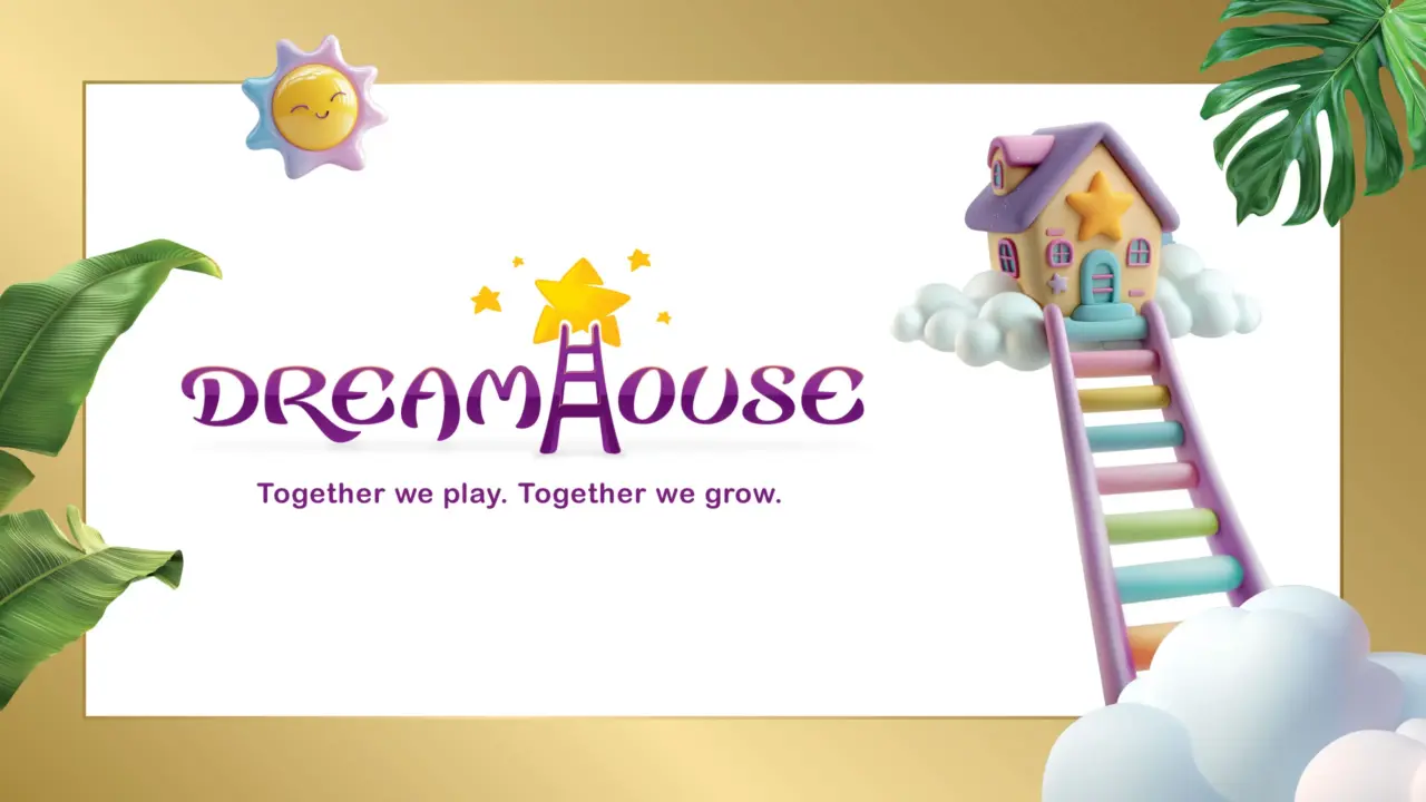
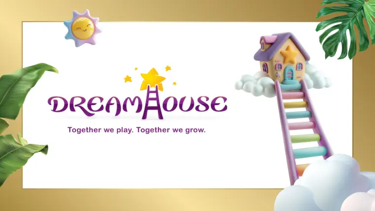
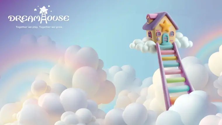
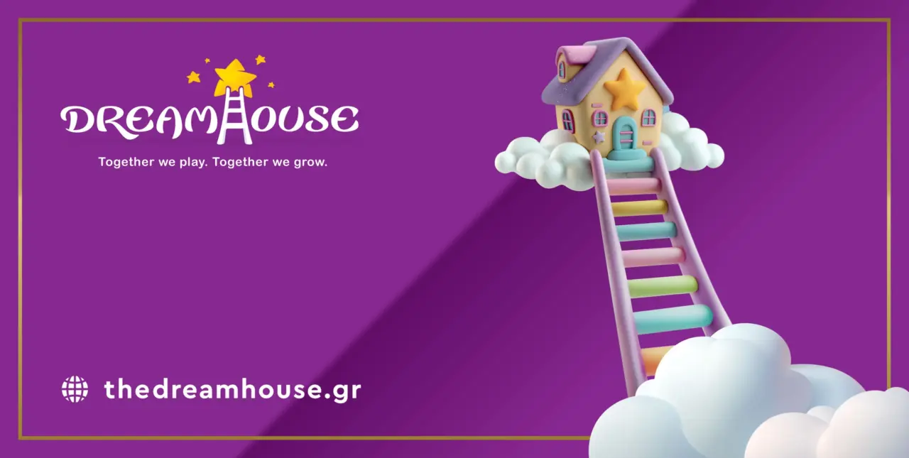
The strategic foundation of the rebranding project was built around joy, imagination and the shared growth journey of both children and adults. The original idea of a ladder leading to a star was retained and developed further as the central symbol of the brand.
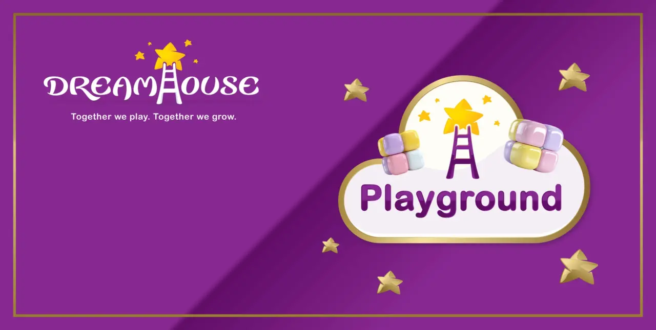
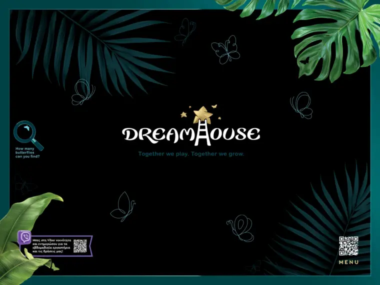
Integrated directly into the typographic structure of the logo, the ladder and star became a visual expression of exploration, creativity, achievement and continuous growth. This gave the Dreamhouse logo a stronger symbolic role, allowing it to communicate the emotional character of the venue while remaining simple, memorable and easy to recognize.
Logo design, brand architecture and custom illustration
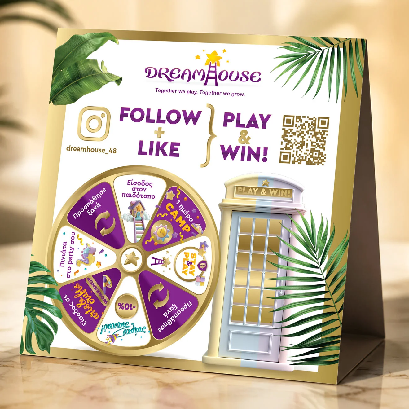
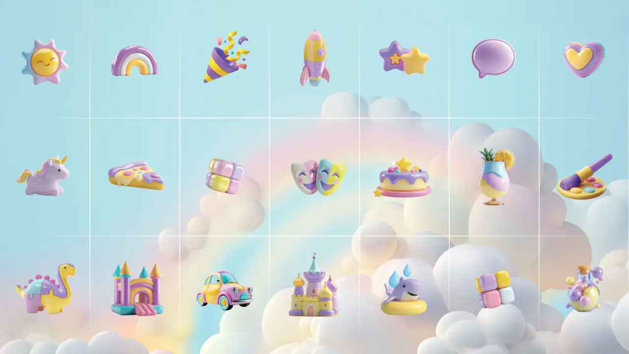
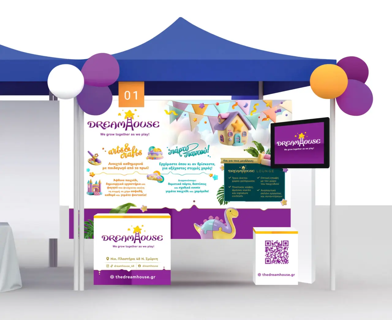
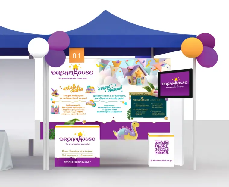
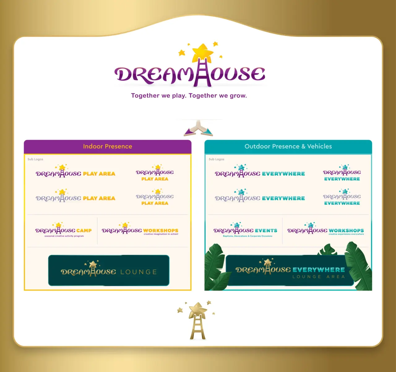
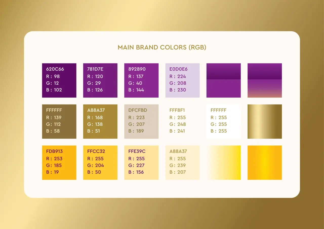
The Dreamhouse rebranding project extended beyond logo design into a complete visual identity system. The work included logo redesign, brand architecture, colour system development, custom illustrations, a supporting library of illustrated graphic elements, various communication materials, environmental applications and a flexible visual ecosystem designed to support the long-term evolution of the brand.
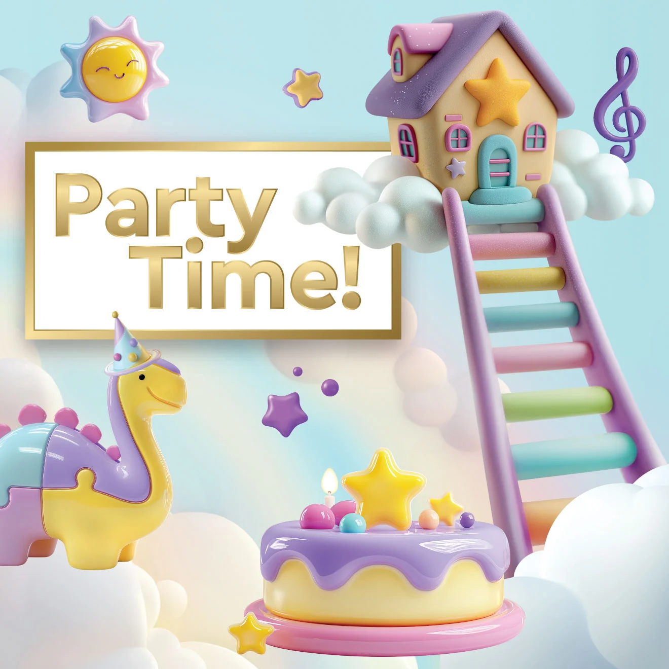
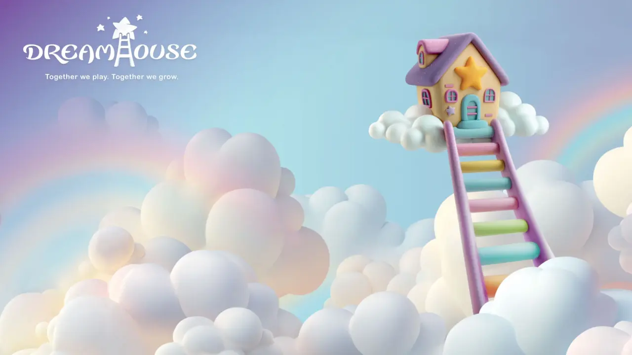
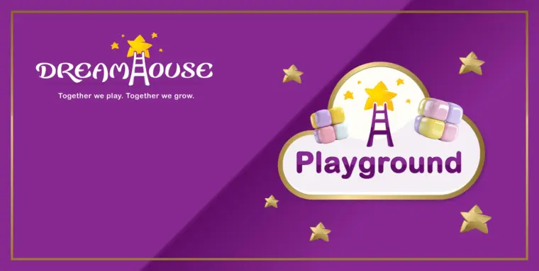
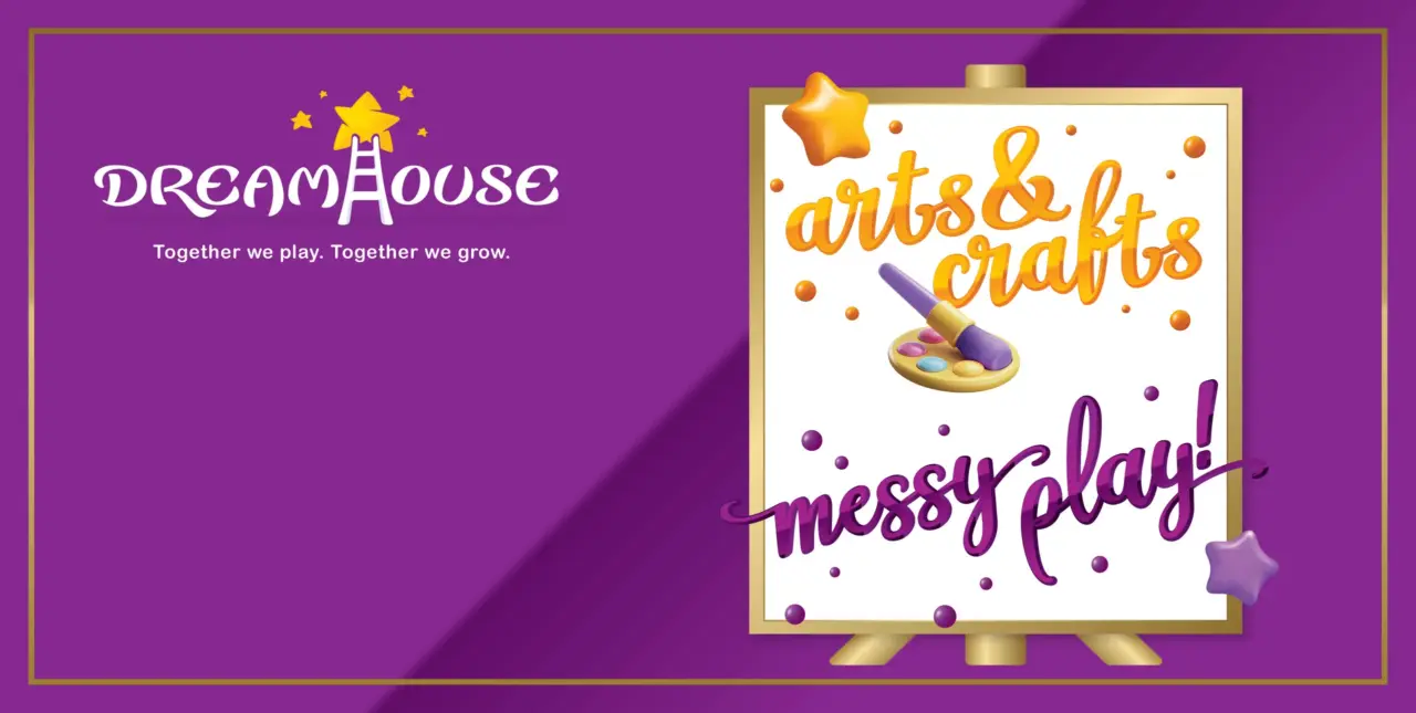
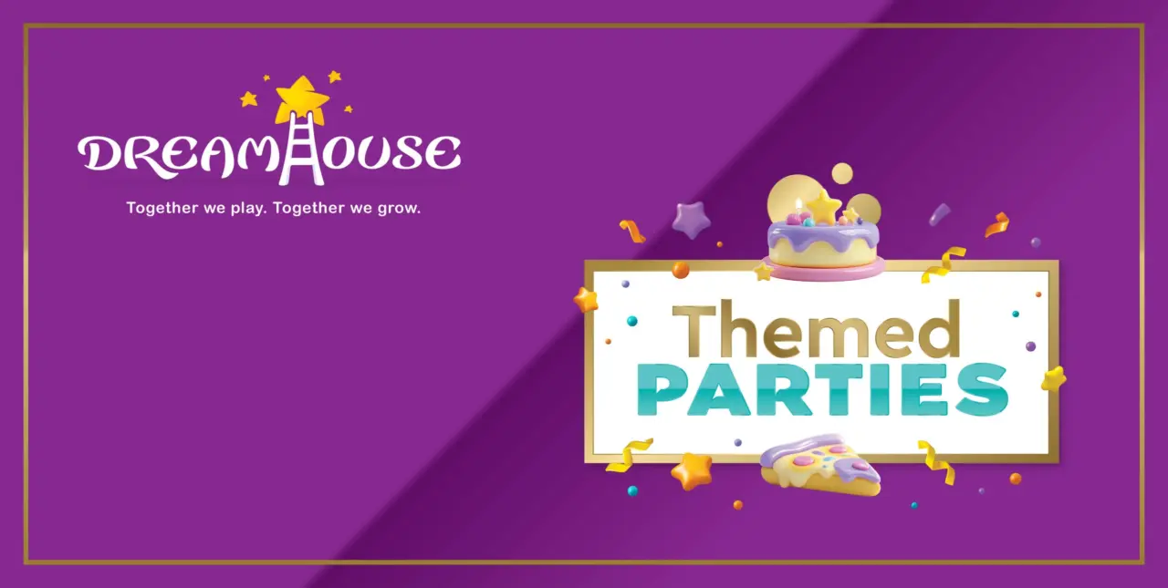
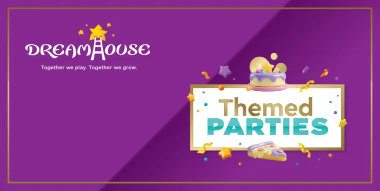
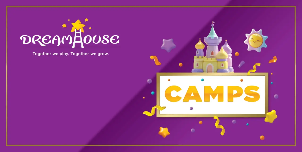
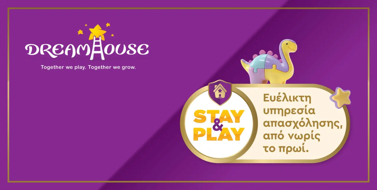
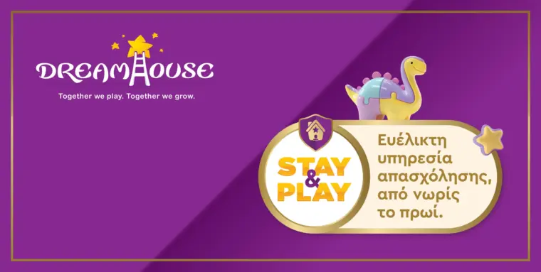
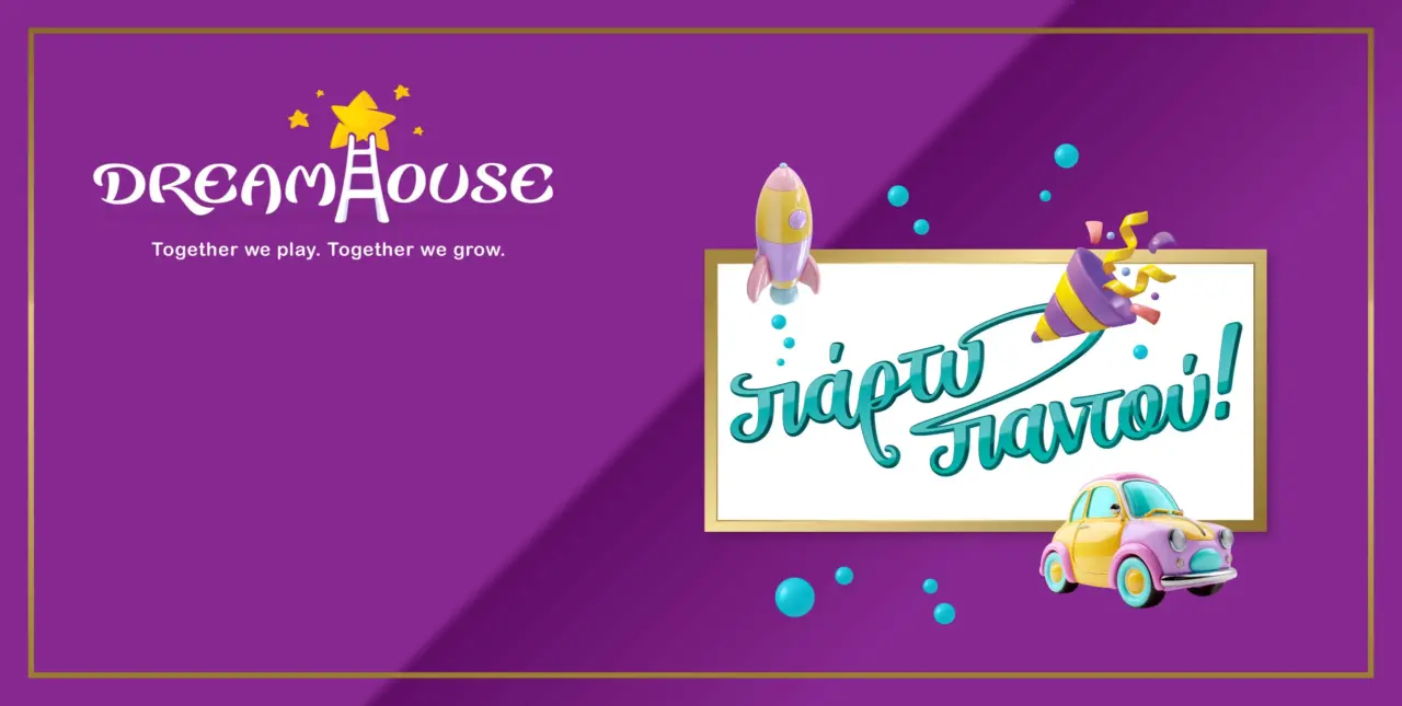
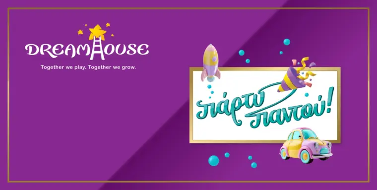
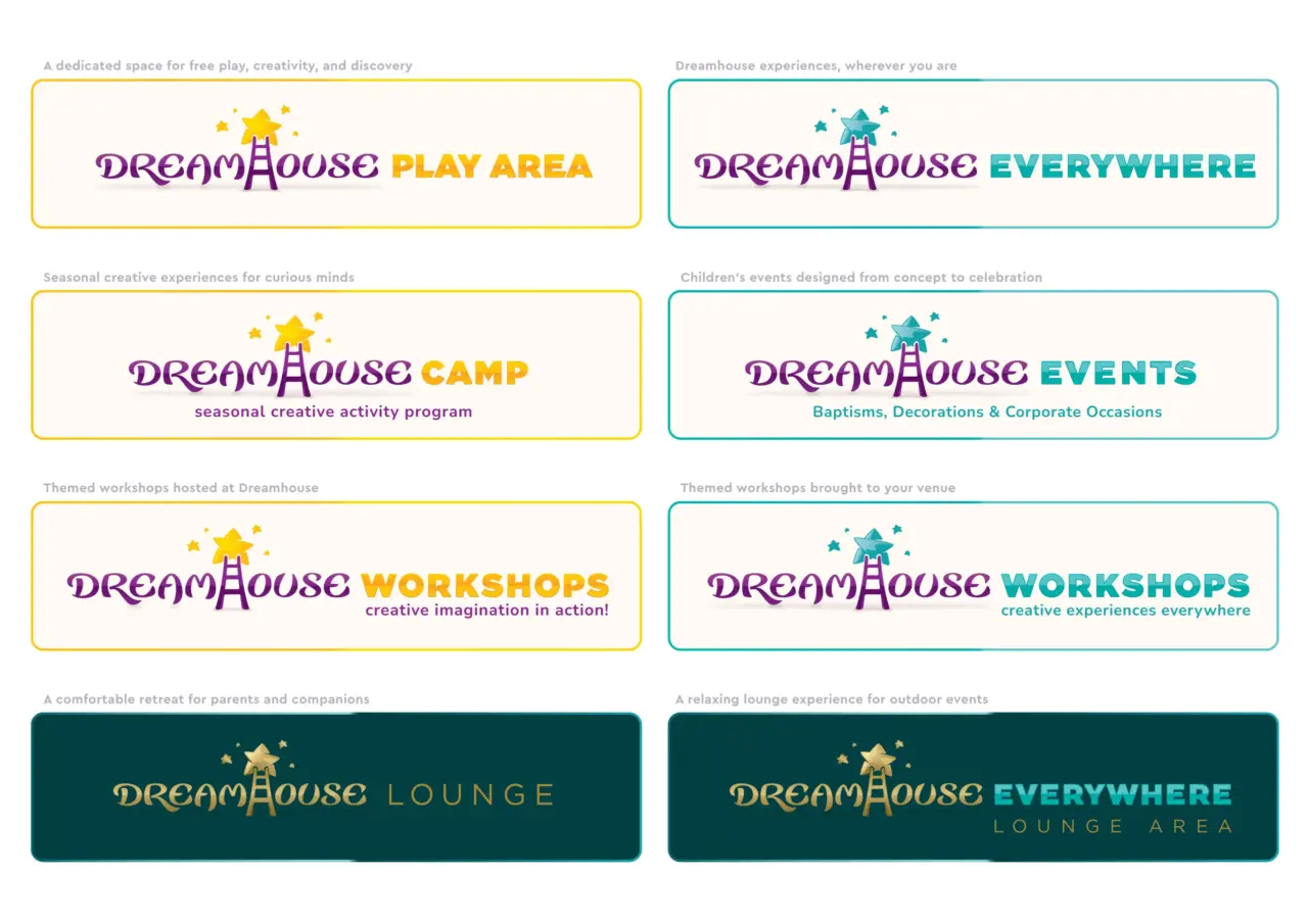
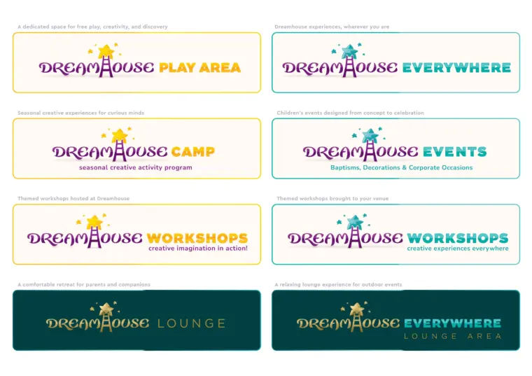
The visual language combines soft playful forms, carefully crafted colour combinations and illustrated elements that help each activity become easier to understand. Every activity category received its own visual identity through custom illustrations, branded signage and promotional assets, helping parents quickly understand the breadth of experiences available while strengthening overall brand consistency.
A scalable visual identity for physical and digital touchpoints
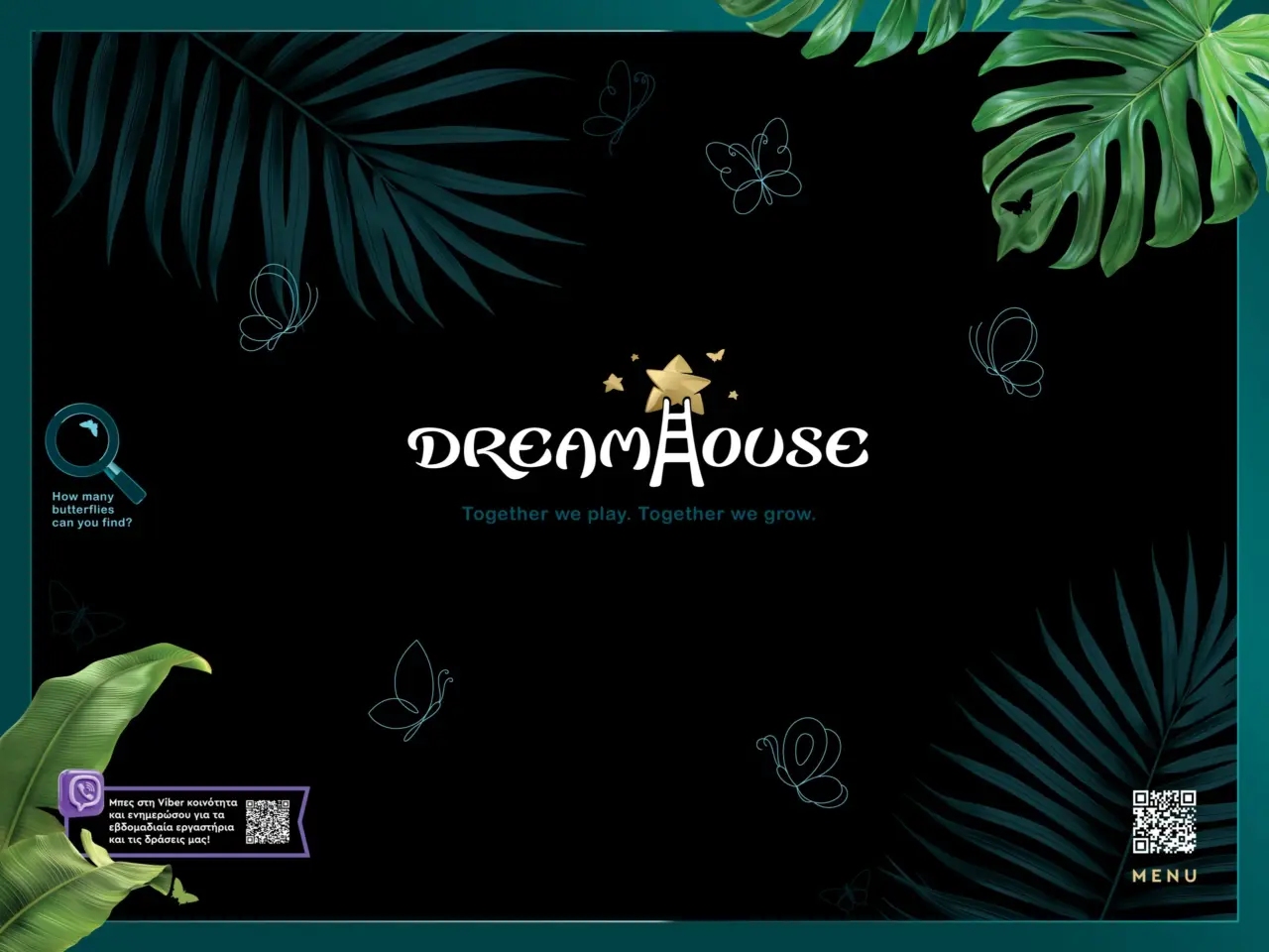
Children’s brands benefit from consistency, recognizability and emotional connection across every interaction. From the logo and colour palette to signage, environmental graphics, printed communication and digital applications, every element contributes to how families perceive and remember the experience.
For Dreamhouse, the visual identity was designed to support both daily activities and future expansion. The system can grow alongside the business while maintaining a clear and distinctive personality across themed events, workshops, play activities, digital communication, printed materials and future service offerings.
Branding that supports recognition and future growth
The result is a complete branding system for a children’s activity venue, designed to make Dreamhouse more recognizable, more organized and more consistent across its customer experience. The brand identity gives the business a stronger foundation for future communication, helping every new application feel connected to the same central idea.


A brand identity system built for recognition and growth
Strong children’s brands are built through consistency, recognisability, and emotional connection across every interaction. From the logo and colour palette to environmental graphics, signage, printed materials, and digital communication, every element contributes to how families perceive and remember the experience.
If your business has evolved beyond the identity that represents it today, it may be time for a more strategic approach to branding. Explore our brand identity redesign services for growing businesses seeking stronger differentiation and recognition and discover how a carefully crafted brand can create greater clarity, consistency, and long term value.