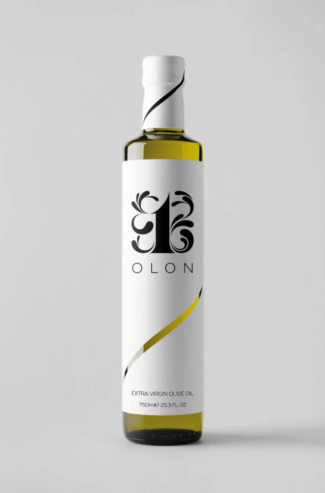
Brand Identity & Packaging Design for OLON Extra Virgin Olive Oil
OLON was created as a premium extra virgin olive oil brand designed to express the purity, quality, and timeless value of an authentic Greek product. The project included the design of the brand identity, logo, and packaging through a minimalist design approach focused on clarity, essence, and the power of symbolism.


The Power of Reduction in Packaging Design
The OLON brand identity and packaging were created around a simple yet meaningful idea: unity.
The name originates from the Greek word “olon”, a concept that expresses wholeness, coherence, and the harmonious coexistence of individual elements within a unified system. This philosophy became the foundation of the entire design approach and informed every decision, from the logo to the packaging.
At the center of the identity stands a logo built around the number “1”, a symbol of unity, purity, and focus on what truly matters. The organic curves surrounding it reference the natural flow of olive oil while simultaneously creating a sense of balance, continuity, and completeness.
The visual simplicity of the design reflects the nature of the product itself. A premium extra virgin olive oil whose value is communicated through authenticity, quality, and timelessness.
The distinctive curve running across the bottle serves as the central connecting element of the system. Its upward movement symbolizes continuous motion, growth, and the dynamic energy that emerges within a complete and interconnected whole. At the same time, its fluid and effortless expression introduces a sense of freedom and flow, creating balance between geometric discipline and the natural character of the product.
Beyond its symbolic role, the curve also serves a functional purpose by revealing the olive oil level inside the bottle, transforming functionality into an integral part of the packaging’s visual identity.
The bottle and label were designed as a unified communication system. Every element was carefully developed to strengthen brand recognition, enhance perceived product value, and create a distinctive presence on the shelf.
The result is a complete olive oil branding and packaging design project that combines strategic thinking, visual clarity, and functionality. A system designed to communicate quality, timelessness, and internal harmony through the minimum amount of visual information, demonstrating the power of reduction as a tool for differentiation within the premium food sector.
Services:
• Brand Identity Design
• Olive Oil Branding
• Olive Oil Packaging Design
• Product Label Design
• Logo Design
• Food Packaging Design
• Premium Packaging Design
• Brand Strategy
• Art Direction
• Visual Identity Design
If this project inspired you, we would be delighted to explore how strategic visual communication can elevate the quality, origin, and uniqueness of your own product, starting with your own olive oil packaging design.